Previous Page Next Page
Manipulating Data Components
Manipulating a table
Manipulating a crosstab
Manipulating a chart
Manipulating a KPI component
Manipulating geographic map group markers/areas
Converting between table/crosstab/chart using visualization toolbar
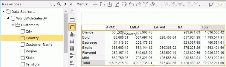
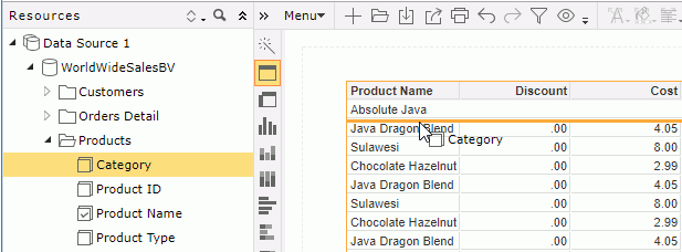
You can manipulate data components, which refer to tables, crosstabs, charts, KPI components, and geographic maps, in Web Report Studio as shown below. Note that, most of the manipulations require selecting the component first. To select a component, hover the mouse pointer on the component, when the icon  appears at its upper left corner, click the icon.
Manipulating a table
- Showing/Hiding the headers/footers and detail in a table
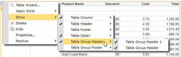
Right-click the icon of the table, then on the shortcut menu, select/unselect the corresponding names from the Show > Table Header/Table Footer/Table Detail/Table Group Header/Table Group Footer submenu to show/hide them.
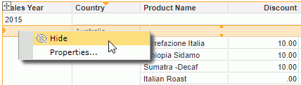
You can also hide a table header, footer or the detail as follows: click anywhere in the corresponding row and when the button  appears at the leftmost on the row click the button to select the row, then right-click on the selected row and select Hide from the shortcut menu.
- Show/Hiding table columns
There are the following ways to show/hide a table column:
- To show/hide a column, right-click the icon of the table, then on the shortcut menu, select/unselect the column names from the Show > Table Column submenu to show/hide them.
- To hide a column, click anywhere in the column, click the button
 appearing on the column header to select the column, then right-click on the selected column and select Hide.
- To show/hide a detail column, select the table and then click the Show/Hide Detail button
 on the toolbar. From the drop-down list, select/unselect the object name to show/hide its detail column.
- To show/hide a summary column, select the table and then click the Show/Hide Summary button
 on the toolbar. From the drop-down list, select/unselect the aggregation object name to show/hide the corresponding summary.
- Adjusting order of columns in a table
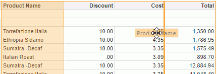
The order of columns in a table can be easily adjusted. To do this, click anywhere in a column, then click the button that appears on the column header to select the column. Drag the selected column to the left or right boundary of another column, when a highlighted line appears along the column boundary, release the mouse button.
- Changing the table definition
- Select the table and do one of the following:
- Click Menu > Edit > Wizard.
- Click the Table Wizard button
 on the visualization toolbar.
- Right-click the icon of the table and select Table Wizard from the shortcut menu.
The Table Wizard appears.
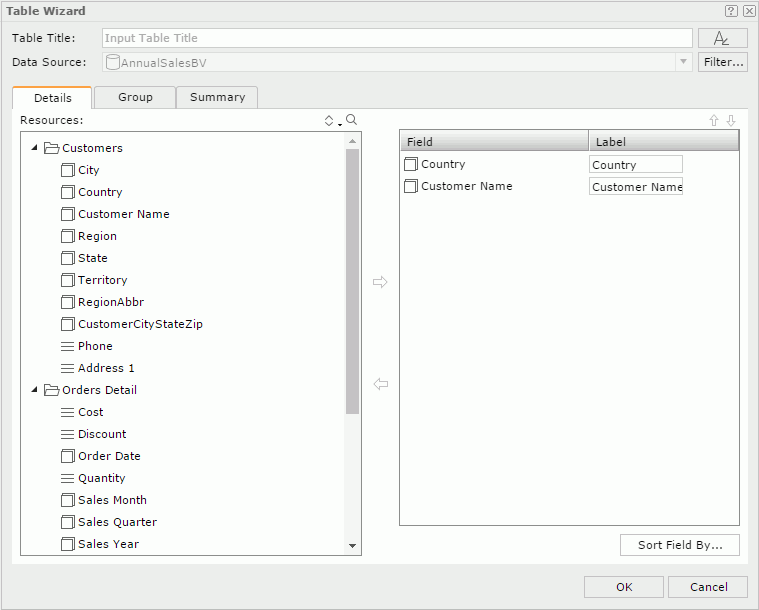
- In the Table Title text box, edit the title of the table. You can click
 to customize the font, size, and style of the title.
- Click the Filter button to apply some filter conditions on the business view the table uses to narrow down data displayed in the table.
- Define the data displayed in the table.
- When the table is one of the types: Group Left, Group Above, or Group Left Above,
in the Details tab, add or change the detail fields displayed in the table, in the Group tab, modify the grouping criteria of the table; in the Summary tab, modify the summary fields of the table.
- When the table type is Summary Table, in the Columns tab, change the fields you want to display in the table; in the Summary tab, add or edit the aggregations in the header/footer rows of the table and groups.
- Click OK to apply the modifications.
Click here for more information about how to define a table.
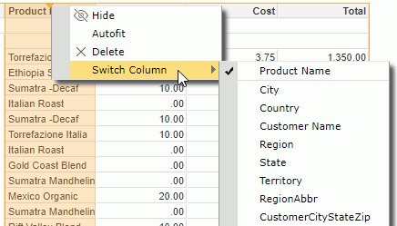
- Switching table column fields
In addition to the above method, another more convenient way to change the fields displayed in the detail columns or group columns of a table is by using the Switch command.
- To change the field in a detail column:
Click anywhere in the column, then click the arrow button that appears on the column header to select the column. Right-click on the column and select Switch Column from the shortcut menu. The objects in the business view used by the table which are available for the detail column are listed in the submenu with the currently used one checked. Select the object you want to use to replace the current one in the column.
- To change the group field in a group column:
Right-click any value of the group and select Switch Group from the shortcut menu. Group objects in the business view used by the table are listed in the submenu with the currently used one checked. Select the group object you want to use to replace the current one in the column.
- Adding/Removing groups in a table
You can add more groups into a table or remove the groups that are not required from a table.
- To add a group into a table:
Select the table, then on the toolbar click the Add/Remove Group button  . A list containing the group objects in the business view used by the table is displayed. Select the group object you would like to add into the table as a group. If there is no existing group in the table, the added group will be placed at the left-above position. If the table already contains groups, the new group will be added as the highest level group and follow the same position pattern as the closest existing group.
- To remove a group from a table:
- Right-click any value of the group and select Delete from the shortcut menu.
- Select the table, then use the Add/Remove Group button on the toolbar: unselect the group you want to remove from the drop-down list.
- Click any value of the group, then click the arrow button that appears at the leftmost on the row to select the group row, or the button on the column header to select the group column. Drag and drop the row or column outside the report page.
- Sorting the data in a group table
You can take the following ways to sort data in a group table, and when you sort a group table by values in a detail column and then values in another detail column, data in the table will be sorted by the later sort condition first and then by the former sort condition.
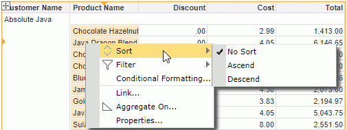
- Using shortcut menu
To sort the data based on values in any column, right-click any value in the column, then on the shortcut menu select Ascend or Descend from the Sort submenu. If the column is a group column, groups in the current group level will be rearranged. To remove the sort condition, select No Sort.
- Using the sort button on table column header
You can use the sort button on any table column header to sort values in the column if the feature is enabled in the server profile. By default the feature is enabled.
- Put the mouse pointer on any column header and you can find the sort button
 .
.
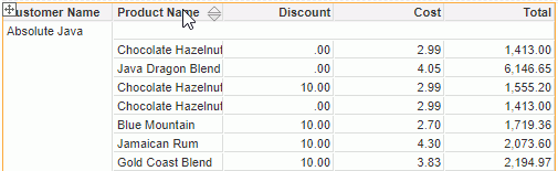
- To sort values in the column ascending, click the upward triangle; to sort the values descending, click the downward triangle. When a sort order is applied, the corresponding triangle will be highlighted. To remove the sort order, click the highlighted triangle.
A summary column that contains multiple aggregation objects cannot be sorted using this way. Moreover a group header in a table created in Web Report Studio is always merged as a table cell. If a summary column contains only one aggregation object which is in a merged group header, you cannot use this way to sort it either.
- Using labels
With JReport Designer, you can bind a label in a table with a field used in the table to enable sorting on the label by setting the label's Bind Column and Sortable properties. Then when running the table in Web Report Studio you can click the sort button beside the label to sort values of the bound field. This functions the same as via the table column headers.
When a label is bound with a field, if the Sort on Column Header feature is also enabled, the former has higher priority. For example, if you bind the label in column A header with the field in column B, when clicking the sort button on column A header, values in column B are sorted.
- Sorting the data in a summary table
You can use the same methods on group tables to sort the group and summary columns in summary tables. However for summary tables, you can define whether to use major sort or minor sort via the server profile (Profile > Customize Server Preferences > General > Use Major Sort as Default). By default, major sort is applied which is to sort data in a summary table by the last sort condition only, that is to say the later sort condition always replaces the former one. When minor sort is used, sort of a lower group is always based on the sort result of all its higher level groups.
For example, a summary table contains group columns G1, G2 and G3 (G1 the highest group level and G3 the lowest) and the summary columns S1 and S2. When minor sort is applied, after sorting the group column G1 ascending, if you apply a sort on G2 descending, the table will be sorted based on G1 ascending firstly and then G2 descending; if you further sort G3 descending and the sort result is G1 ascending, G2 descending and G3 descending. Based on this sort result, if you apply the ascending order on the summary column S1, the table will be sorted based on G1 ascending, G2 descending and S1 ascending. Sort order on G3 is removed, this is because all summary columns calculate data based on the lowest group in a summary table and they are considered as one group, so on the lowest group and the summary columns only one sort order can take effect. Therefore based on the former sort result, if you apply a sort order on G3 again the sort on S1 will be removed.
- Aggregating on a detail column
You can summarize the data in a detail column. To do this:
- Do either of the following:
- Right-click any value in the detail column and select Aggregate On from the shortcut menu.
- Click anywhere in the column, then click the button that appears on the column header to select the column. On the toolbar, click the Aggregate On button
 .
.
- In the Aggregate On dialog, specify a function from the Function drop-down list to summarize the data.
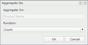
- When done, click OK.
- If the table has groups, you will find data in each group level and the whole table are summarized respectively in the column.
- If the table has no groups, the summary will be based on the whole table.
When you finish summarizing a detail column, you can find a dynamic aggregation is created at the same time in the Dynamic Resource > Aggregations list in the Resources panel, which is given a default name Function_DetailFieldName. You can use it again in the current report if required.
- Customizing the data value formats
You can customize the data format of the values in a table if they are of the Number or Date/Time type. To do this, right-click on any value, then select a format from the Format submenu, or input a format in the text box at the bottom of the submenu and click Enter on the keyboard.
- Adjusting the width of table columns according to contents
When the contents in a table column need more space to completely display, you can adjust the width of the table column according to the contents. To do this, click anywhere in the column and click the button that appears on the column header to select the column, then right-click on the selected column and click Autofit on the shortcut menu. However it takes effect only when the property Autofit for the data field or label in the column is also set to true.
- Showing/Hiding summary fields in header/footer rows in a summary table
When creating or editing a summary table via the table wizard, once you have placed any aggregation object on its table header/footer or group header/footer, after the table is generated the Show Summary Field command will be activated on the shortcut menu of all the summary columns in the table. You can use the menu command to show or hide the aggregation objects in the header/footer rows. To do this, click anywhere in the summary column that contains the required aggregation object, click the button appearing on the column header to select the column, then right-click on the column and from the Show Summary Field submenu select/deselect the corresponding table/group header/footer to show/hide the aggregation object on the specified locations.
- Removing table columns
To remove a table column, click anywhere in the column, then click the button that appears on the column header to select the column. Right-click on the selected column and click Delete on the shortcut menu, or drag and drop the column outside the report page.
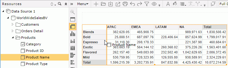
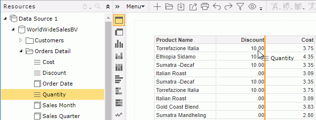
From the Resources panel, you can drag view elements and dynamic resources into a table to add new columns/rows in the table. To do this, first select the table to locate the business view it uses in the Resources panel, then:
- To add a new table column:
Drag the required object from the Resources panel and move the mouse pointer to the boundary of an existing table column until a highlighted vertical line appears, then release the mouse. The new column will be placed where the highlighted line lies.
- To add a new group row:
Drag a group object  or dynamic formula used as Group from the Resources panel and move the mouse pointer in the detail section or to the boundary of an existing table group row until a highlighted horizontal line appears, then release the mouse. The new group row will be placed where the highlighted line lies.
Manipulating a crosstab
- Changing the crosstab definition
- Select the crosstab and then do one of the following:
- Click Menu > Edit > Wizard.
- Click the Crosstab Wizard button on the visualization toolbar.
- Right-click the icon of the crosstab and select Crosstab Wizard from the shortcut menu.
The Crosstab Wizard appears.
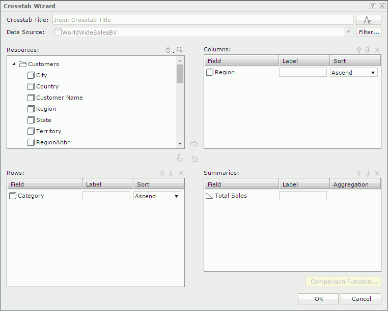
- In the Crosstab Title text box, edit the title of the crosstab. You can click to customize the font, size, and style of the title.
- Click the Filter button to apply some filter conditions on the business view the crosstab uses to narrow down data displayed in the crosstab.
- Change the column/row fields and summaries displayed in the crosstab.
- Click OK to apply the modifications.
Click here for more information about how to define a crosstab.
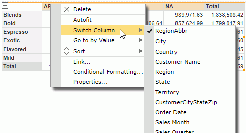
- Switching crosstab fields
In addition to the above method, another more convenient way to change the fields in a crosstab is by using the Switch command. To do this, right-click a column header/row header/summary value and select Switch Column /Switch Row/Switch Summary from the shortcut menu. Objects in the business view used by the crosstab which are available for the column/row/summary are listed in the submenu with the currently used one checked. Select the object you want to use to replace the current one.
- Sorting data in a crosstab
You can make the records in a crosstab sorted based on any column or row field. To do this, right-click on any value on the column or row header, then choose the command Sort > Ascend or Sort > Descend from the shortcut menu. To remove the sort condition, click Sort > No Sort from the shortcut menu.
- Converting a crosstab into a chart
- Select the crosstab and then do either of the following:
- Click Menu > Edit > To Chart.
- Right-click the icon of the crosstab and select To Chart from the shortcut menu.
The To Chart dialog appears.
- In the Title text box, input a title for the chart. You can click to customize the font, size, and style of the title.
- The Resources box lists the view elements used in the crosstab. The chart can only be defined based on these objects. Select the required chart type from the chart type drop-down list. Add a group object from the Resources box to the Category box, and so to the Series box, and aggregation objects
 or detail objects
  to the Show Values box respectively.
If you select a bubble chart type, you need to specify the fields to be shown on the bubble X axis, Y axis and the value you want to show as the bubble radius in the Show Values box. Note that when you specify a value for the bubble X axis, this value will be displayed on the category axis instead of the one specified in the Category box. However, the value defined in the Category box will also be included in data calculation.
- Click the OK button to finish the conversion.
Click here for more information about how to define a chart.
- Rotating a crosstab
Columns and rows in a crosstab can be exchanged. This operation is called rotating a crosstab.
To rotate a crosstab, first select it, and then do one of the following:
- Click Menu > Edit > Rotate Crosstab.
- Click the Rotate Crosstab button
 on the toolbar.
- Right-click the icon of the crosstab and select Rotate Crosstab from the shortcut menu.
- Customizing the data value formats
You can customize the data format of the values in a crosstab if they are of Number or Date/Time type. To do this, right-click any value, then select a format from the Format submenu, or input a format in the text box at the bottom of the submenu and click Enter on the keyboard.
- Auto fitting values in a crosstab
When the values in the crosstab row/column headers or aggregation cells need more space to completely display, right-click any value in the row/column header or aggregation cell and select Autofit from the shortcut menu. JReport then adjusts the width of the corresponding cells to match the contents in them.
- Removing column/row headers or summaries from a crosstab
Drag a value in the column/row header or any summary value and drop it outside the report page.
From the Resources panel, you can drag view elements and dynamic resources into a crosstab to add new column/row headers and summaries in the crosstab. To do this, first select the crosstab to locate the business view it uses in the Resources panel, then:
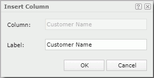
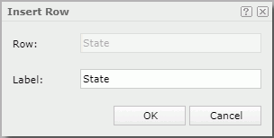
- When the crosstab has no column/row/summary labels, the new row header will be directly placed where the highlighted line lies.
- When you have specified any labels to label the columns/rows/summaries in the crosstab using wizard, the Insert Row dialog appears. You can specify a label to label the new row header if necessary. Click OK and the new column header will be placed where the highlighted line lies.
- To add an aggregation to summarize data in the crosstab:
Drag a detail object , aggregation object , or dynamic formula/aggregation from the Resources panel and move the mouse pointer above or under the desired subtotal, total or grand total cell until a highlighted horizontal line appears, then release the mouse.
- If the selected object has been predefined with an aggregate function,
- When the crosstab has no column/row/summary labels, the object is inserted into the specified position directly.
- When you have specified any labels to label the columns/rows/summaries in the crosstab using wizard, the Insert Aggregation dialog appears. You can specify a label to label the newly created summaries if necessary. Click OK and the object is inserted to the specified position.
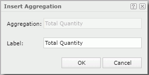
- If the selected object has no predefined aggregate function, the Insert Aggregation dialog appears. From the Aggregate Function drop-down list, select the function to summarize the object, then input a label to label the newly created summaries if necessary. Click OK and the object is inserted to the specified position. However, whether the label you specify would be displayed depends on if you have added any labels to label the columns/rows/summaries in the crosstab using wizard and if there is appropriate position to place the label in the current crosstab. If no label is defined in the wizard, the label you add in the Insert Aggregation dialog will be ignored. After the object is inserted in the crosstab, you can switch the aggregate function it uses at anytime. To do this, right-click it and select Switch Function from the shortcut menu, then choose a new function from the submenu.
Manipulating a chart
For the chart in a KPI component, that is a KPI chart, only some of the following operations are supported.
- Changing the chart definition
- Do one of the following to access the Chart Wizard:
- Select the chart, then click Menu > Edit > Wizard.
- Select the chart, then click the Chart Wizard button on the visualization toolbar.
- Right-click on the chart and select Chart Wizard from the shortcut menu.
The Chart Wizard appears.
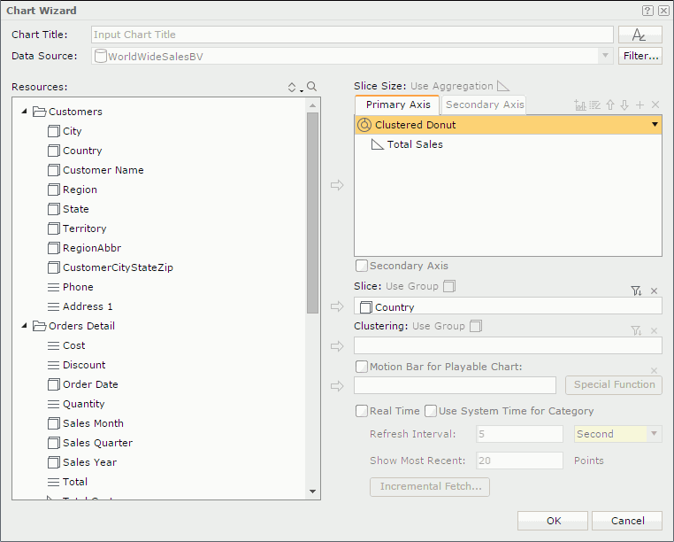
- In the Chart Title text box, edit the title of the chart. You can click to customize the font, size, and style of the title.
- Click the Filter button to apply some filter conditions on the business view the chart uses to narrow down data displayed in the chart. The button is not available for a KPI chart.
- Change the fields displayed on the chart and specify other options as required.
- Upon finishing, click OK to apply the modifications.
Click here for more information about how to define a chart.
- Switching chart fields
In addition to the above method, another more convenient way to change the fields displayed on a chart is by using the Switch command.
- To change the field on the value axis:
Right-click on the chart and click Switch Values on the shortcut menu. All the aggregation objects of the business view on which the chart is created are listed in the submenu with the currently used one checked. Click an unchecked aggregation object to add it to the value axis.
If a chart has multiple fields on its value axis, you can also click the up or down arrow beside the currently used ones to adjust their order, or click a checked field to remove it from the chart. When there is only one field on the value axis, it cannot be removed.
For a combo chart, you can change the fields displayed on the chart one by one for each chart type.
- To change the field on the category/series axis:
Right-click on the chart and select Switch Category/Switch Series from the shortcut menu. All the group objects of the business view on which the chart is created are listed in the submenu with the currently used one checked. Select the group object you want to use to replace the current one on the axis.
- Sorting the data in a chart
Data labels on the category and series axes of a chart can be sorted alphabetically. To do this, right-click the chart, then on the shortcut menu select Ascend or Descend from the Sort Category or Sort Series submenu. To remove the sort condition, click No Sort on the Sort Category or Sort Series submenu.
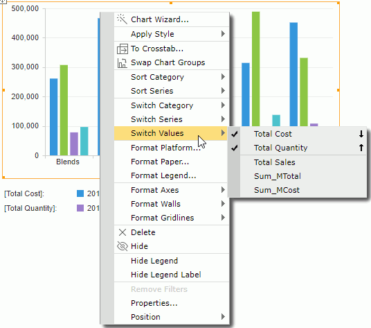
- Swapping chart groups
You can swap the chart groups by switching data between the category and series axes, or between the category and value axes when a chart has no field on the series axis but several on the value axis.
- To switch data between the category and series axes, first select the chart, then click the Swap Chart Groups button
 on the toolbar; or right-click on the chart and select Swap Chart Groups from the shortcut menu.
- To switch data between the category and value axes, select the chart and then click the Swap Chart Groups button on the toolbar.
- Formatting chart elements
You can format the chart platform, paper, legend, wall, X and Y axes/gridlines, and rectangles and rectangle titles of heat maps using the corresponding format command on the shortcut menu of a chart (for a KPI chart only platform, paper and wall). For details about the element properties, refer to the specific format dialog in Web Report Studio Dialogs.
- Changing the chart type
Select the chart, then on the toolbar, click the Chart Type button  . From the drop-down list, select the desired chart type and its subtype.
- Converting a chart into a crosstab
- Select the chart and then do either of the following:
- Click Menu > Edit > To Crosstab.
- Right-click on the chart and click To Crosstab on the shortcut menu.
The To Crosstab dialog appears.
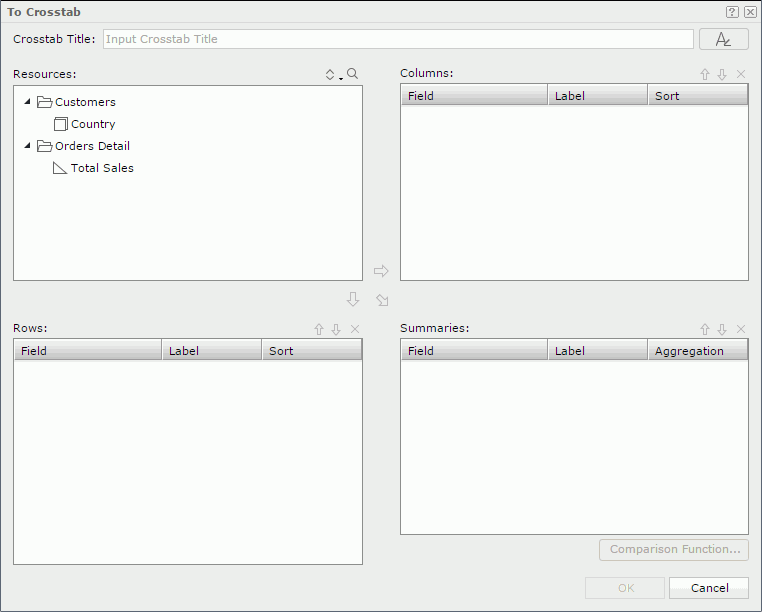
- In the Title text box, input a title for the crosstab. You can click to customize the font, size, and style of the title.
- The Resources box lists the view elements used in the chart. The crosstab can only be defined based on these objects. Add the group objects to the Columns and Rows box as the group fields in the crosstab; add aggregation objects or detail objects to the Summaries box as the aggregate fields to summarize data in the crosstab (for a detail object specify the aggregate function for it in the Aggregation column).
In the Label column, you can edit the label of a group field or aggregate field to label the columns, rows and summaries in the generated crosstab. In the Sort column, specify a sorting manner on a group field.
If necessary, click the Comparison Function button to set the comparison function for the aggregate fields.
If you want to remove any group/aggregate field, select it and click  .
.
To adjust the order of group/aggregate fields, select a group/aggregate field and click  or
or  .
.
- Click OK to finish the conversion.
Notes:
- The org chart type cannot be converted to crosstab or any other chart type, and vice versa.
- Additional values are supported only in chart. If you convert a chart with additional values into crosstab, the additional values are not converted together with the chart.
- Showing/Hiding the chart legend or legend label
Right-click on the chart, then select the corresponding Show or Hide command from the shortcut menu to show or hide the legend or legend label. However, the legend will always be displayed in the export or print result.
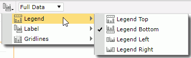
- Changing the chart legend position
Chart legend can be placed at the top, bottom, left or right position in a chart. To change the legend position, select the chart, then on the toolbar, click the Chart Options button  . From the drop-down menu, go to the Legend submenu and select the desired position.
- Showing/Hiding labels on the X/Y axis
Select the chart, then on the toolbar, click the Chart Options button . From the drop-down menu, go to the Label submenu, then select/unselect the desired labels to show/hide them.
- Showing/Hiding X/Y gridlines
Select the chart, then on the toolbar, click the Chart Options button . From the drop-down menu, go to the Gridlines submenu, then select/unselect the desired gridlines to show/hide them.
When gridlines are shown, it is better to also have the wall shown so as to make the background gridlines more intuitive. To show the wall, follow the steps above, then on the Gridlines submenu, select Wall.
- Customizing the data format of chart data labels
You can customize the data format of the legend entry labels and data labels on the category and series axes if they are of Number or Date/Time type. To do this, right-click on any label and select the required format from the Format submenu, or input a format in the text box at the bottom of the submenu and click Enter on the keyboard.
- Stopping or resuming a real time chart from refreshing
For a real time chart, you can stop or resume it from automatically refreshing by right-clicking it and selecting the Pause Refresh or Resume command from the shortcut menu.
- Zooming in chart values
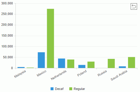
For a bar, bench, line, area, or stock chart, you can select the values you are interested in to have them zoomed in. To do this, make sure you are in View Mode of Web Report Studio, then drag the mouse from the start value to the end value you want to select and release the mouse.
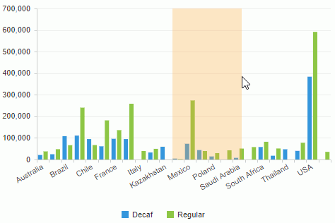
The selected values are zoomed in. To return to the initial status, click the return button  on the upper right corner of the chart paper.
Manipulating a KPI component
- Removing the KPI chart from a KPI component
Right-click the icon of the KPI component, then on the shortcut menu click Remove KPI Chart.
Manipulating geographic map group markers/areas
- Going up/down on geographic map group markers/areas
- For the group level that is higher than some other group levels in a geographic map component, point to its group marker/area, right-click it and select Go Down from the shortcut menu to jump one group level down.
- For the group level that is lower than some other group levels in a geographic map component, point to its group marker/area, right-click it and select Go Up from the shortcut menu to jump one group level up.
- Showing/Hiding geographic map group markers/areas
By default, all visible group markers/areas are shown. To hide them, right-click the geographic map (not the group markers/areas) and select Hide Markers/Hide Areas from the shortcut menu. If you want to show them again, right-click the geographic map and select Show Markers/Show Areas from the shortcut menu.
Converting between table/crosstab/chart using visualization toolbar
Tables, crosstabs, and charts can be converted to one another easily using the visualization toolbar (a chart in a KPI component can only be converted to another chart). When the current data component contains enough data fields for the target component type, the conversion is accomplished directly. Otherwise, a conversion dialog pops up which allows you to reload all the objects from a business view and then to define the target component.
To convert to a table:
A table, crosstab, or chart can be converted to a table. Select the data component and then click  on the visualization toolbar.
- When you are converting a crosstab or chart to a table, the table will be generated directly according to the data fields in the crosstab or chart.
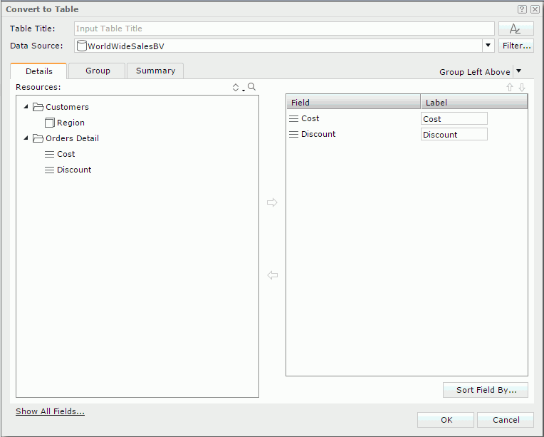
- When you are converting a table to a table, the Convert to Table dialog is displayed for you to define the new table. You can select another business view for the table or use the current one. If the current one is used, click the Show All Fields link to show all the objects in the business view. Click here for more information about how to define a table.
To convert to a crosstab:
A table or chart can be converted to a crosstab. Select the data component and then click  on the visualization toolbar.
- When the data component contains enough data fields required by a crosstab, the crosstab will be generated directly according to the current data fields.
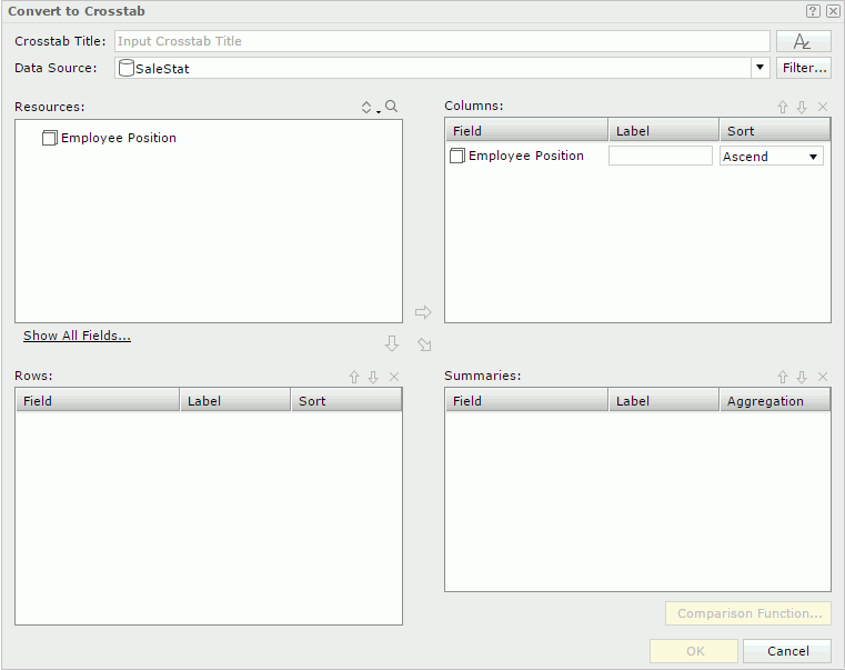
- When the current data fields are not enough for a crosstab, the Convert to Crosstab dialog is displayed for you to select more fields to define the crosstab. You can select another business view for the crosstab or use the current one. If the current one is used, click the Show All Fields link to show all the objects in the business view. Click here for more information about how to define a crosstab.
To convert to a chart:
A table or crosstab can be converted to a chart. One chart type can also be converted to another. Select the data component and then click the desired chart type button on the visualization toolbar.
- When the data component contains enough data fields required by the target chart type, the chart will be generated directly according to the current data fields.
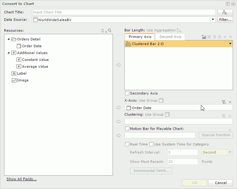
- When the current data fields are not enough for the target chart type, the Convert to Chart dialog is displayed for you to select more fields to define the target chart type. You can select another business view for the chart or use the current one. If the current one is used, click the Show All Fields link to show all the objects in the business view. Click here for more information about how to define a chart.
Previous Page Next Page