 Previous Page Next Page
Modifying a Chart
Editing a chart with wizard
Filtering the data
Defining special groups for category/series/group values
Grouping data on the category/series axis or on a heat map group by intervals
Setting Order/Select N condition for category/series/group field
Editing a chart with wizard
Once a chart has been created, you can further modify it by accessing its shortcut menu wizard which is composed by a set of screens that are similar to the wizard screens used to create the chart. For example, you can change the data used by the chart, modify the chart type, and so on.
- Right-click the chart and select Chart Wizard from the shortcut menu to display the Chart Wizard.
- In the Data screen, specify a new data source for the chart if required.
- In the Type screen, specify the type of the chart.
If you want to change the chart type, you may need to first remove all chart data. Specially, if you change a combo type to a single type or vice versa, JReport will prompt you to make sure because all chart data will be removed automatically.
- In the Display screen, specify the fields to be displayed on the chart.
Use the button
 to replace a current field or
  to add a field.
- In the Layout screen, specify settings for the chart elements.
- In the Style screen, select a style for the chart.
- When done, click Finish to accept the changes.
See also:
Note:
While changing a type of 2-D chart to another type of 2-D chart, or a type of 3-D chart to another type of 3-D chart, all the previous properties will be kept. Nevertheless, when changing a 2-D chart to a 3-D chart, the properties of the Z axis, the Y-Z wall, and the floor of the 3-D chart will be set to default values (since a 2-D chart does not have the Z axis, the Y-Z wall, or the floor), and all other properties will be taken from the 2-D chart. When changing a 3-D chart to a 2-D chart, the properties of the Y2 axis of the 2-D chart will be set to default values (since a 3-D chart does not have the Y2 axis).
Filtering the data
You can also apply filter conditions to narrow down the records displayed in the chart the same as you do for a table (for details, see Filtering the Data). However, if the chart is created on an HDS, the conditions you define in the Edit Filter dialog will not be applied when the chart runs due to the specialty of HDS. Therefore, if you want to filter the data displayed in such kind of charts, you need to make use of the dataset filter.
Defining special groups for category/series/group values
You can define how to group values on the category/series axis of a chart or on a heat map group. To do this:
- In the Display screen of the Chart Wizard, click the Special Group button. The User Defined Group dialog appears.
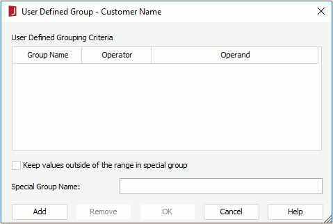
- Click the Add button to add a grouping line and specify the Group Name, Operator and Operand as required. Repeat this to add more group criteria.
For example, if you place a field named Score for grouping which contains student scores that range from 0 to 100, and you want to group the students in 5 ranks, namely rank A: 90~100, B: 80~89, C: 70~79, D: 60~69, and F: 0~59. You can set the groups as follows:
| Group Name |
Operator |
Operand |
| A |
between |
Op1: 90, Op2: 100 |
| B |
between |
Op1: 80, Op2: 89 |
| C |
between |
Op1: 70, Op2: 79 |
| D |
between |
Op2: 60, Op2: 69 |
| F |
<= |
59 |
There will be five groups in the order from A to F. If you want to change the order of the groups, you can also do so via the User Defined Group dialog.
- Check Keep values outside of the range in special group checkbox if you want to put the values that are not included in the specified criteria in a new special group, and then provide a name for the special group in the Special Group Name text field.
- Click OK to accept the settings.
- When done, click Finish in the Chart Wizard to apply the changes.
Grouping data on the category/series axis or on a heat map group by intervals
In a page report that is created using query resources, if the data type of the field displayed on the category/series axis of a chart , or the data type of a heat map group field is of Numeric/String/Date/Time type, you can specify special functions to the field so as to group data on the axis or on the heat map group by intervals.
To group data on the category/series axis of a chart or on a heat map group by intervals:
- In the Display screen of the Chart Wizard, click the Special Function button to display the Special Function dialog.
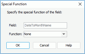
- Select the special function for the category/series/group field from the Function drop-down list (for details about the special functions, refer to Specifying Special Function for Group by Field), then click OK.
- Click Finish in the Chart Wizard to apply the selected special function to the field.
Notes:
- The special function for field on the category axis should be the same as that of the summary displayed on the value axis. If you add a summary with a special function to the value axis, the special function will be automatically applied to the field on the category axis and cannot be changed. If you want to apply a special function to the summary on the value axis, you should make sure the same special function is added to the category field as well. When the summary has no special function applied, you can add special function to the category field as you want.
- If you have defined a special function to the group-by field of a table or banded object, and insert a chart in the table or banded object which inherits dataset from the parent and has the same grouping structure with the parent, then when you view the report, you will find that the special function defined for the field will be applied to the chart too. However, you can specify another special function to the field on the chart axis according to your requirements.
- When both special functions and Select N conditions are defined in a chart, the former takes higher priority. That is to say, grouping data by intervals takes effect before Top/Bottom N.
Setting Order/Select N condition for category/series/group field
One of the most difficult problems with charts is when there are too many category or series values the chart becomes unreadable and also can become very slow to run. So you may want to show only specified category/series values in a chart or specified group values in a heat map and make the values sort according to a specified order. To achieve this, you can use the Order/Select N feature. By specifying a Order/Select N condition, you can decide how many category/series/group values will be displayed in a chart and how the values will be sorted. You can also use an Integer-typed parameter to control the value of Select N.
To specify the Order/Select N condition for the category/series/group field in a chart:
- In the Display screen of the Chart Wizard, click the Order/Select N button to display the Category/Series/Group Options dialog.
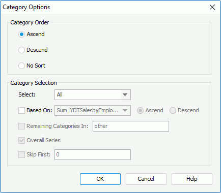
- In the Category/Series/Group Order box of dialog, specify the sort order of the category/series/group values.
- Ascend
Values will be sorted in an ascending order.
- Descend
Values will be sorted in a descending order.
- No Sort
Values will not be sorted and appear in the original order from the database.
- Specify the Select condition to All, Top N or Bottom N.
- All
If selected, all category/series/group values will be shown in the chart.
- Top/Bottom N
If selected, the combo box to the right will be enabled and you can specify an integer number in the text field, or select a parameter which returns an integer from the drop-down list to dynamically define the Top/Bottom N condition, then only the first or last N (N is the number you specify by the integer or parameter) category/series/group values will be shown in the chart.
Note: If you use an Integer-typed parameter to define the Top/Bottom N condition dynamically at runtime, you should make sure that the parameter has at least one default value that is larger than 0, otherwise you will get exceptions when viewing the report.
- Check the Based On checkbox and specify values for the options that follow.
If Based On is unchecked, the order for the first or last N values will be based on what you specify in the Category/Series/Group Order box of the dialog; if you check it, the order will be based on values of the summary field and the sort direction you specify via the drop-down list and radio buttons next to Based On.
- If you have selected Top N or Bottom N from the Select drop-down list, you can check the Remaining Categories In checkbox and then type a character string in the text field to the right, so that the category/series/group values beyond the first or last N range will be merged into the group with the name as that character string.
- If you are specifying the Order/Select N condition for the category field, you can also check Overall Series to specify to calculate the top or bottom N category values based on the series values.
- If necessary, check Skip First and input a number M in the text field to the right, then the first M category/series/group values will be skipped, and the Select N condition will begin with M+1. The skipped values will be merged into the Remaining Categories group.
- When done, click OK to accept the settings.
- Click Finish in the Chart Wizard to apply the changes.
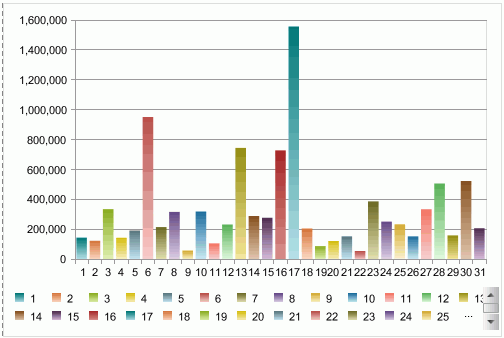
The following example shows how to control the number of field values that will be displayed on a chart.
- Open the catalog file SampleReports.cat in
<install_root>\Demo\Reports\SampleReports.
- Create a web report.
- Insert a chart in the web report which is based on WorldWideSalesBV in Data Source 1, displays in the Clustered Bar 2-D chart type, shows Product ID on X-Axis and Total Sales on Bar Length, and use Neutral as the report style.
- View the chart and it looks as follows:
- Right-click the chart in the report and select Chart Wizard from the shortcut menu to open the Chart Wizard.
- In the Display screen, click the Order/Select N button below the X-Axis box.
- In the Category Options dialog, set the Select condition to Top 6, based on Total Sales descending, then check the Remaining Categories In checkbox and input Other into the text field so as to put the categories that do not meet the condition into the Other group. Click the OK button.
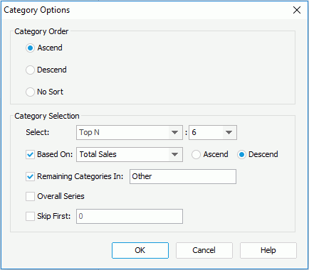
- Click Finish in the Chart Wizard.
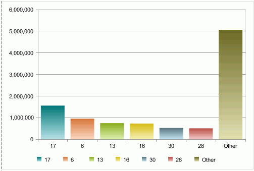
- View the chart. It now shows as follows:
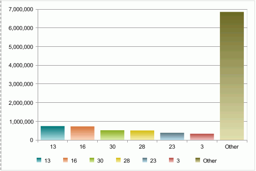
- Back to the Design mode and repeat step 5 to 7.
- In the Category Options dialog, check the Skip First checkbox and input 2 in the text field, then click OK.
- Click Finish in the Chart Wizard.
- View the chart again. The result changes as follows:
Previous Page Next Page