 Previous Page Next Page
Inserting and Defining a Basic Web Control
Text field
Password
Text area
Checkbox/Radio button
Image button
Button
List/Drop-down list
The basic web controls can be inserted into report areas listed in Component placement. This document shows how to insert and define values of the web controls separately.
Text field
A text field is a text box that displays information in one row. You can specify the number of characters to display and the maximum number of characters allowed in a text field.
To insert a text field and define its values:
-
Do one of the following to insert the text field:
- Drag the Text Field button
 from the Components panel to the destination.
- Click Insert > Web Controls > Text Field, then click the mouse button in the destination.
- Right-click the text field and select Display Type from the shortcut menu. The Display Type dialog appears.
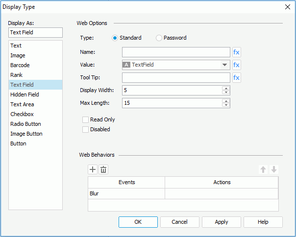
- In the Web Options panel, enter the name, value for the text field in the Name and Value fields.
- In the Tool Tip field, enter the tip you want to show for the text field. Then at server runtime or in HTML results, when you hover the mouse over the text field, the tooltip will be displayed.
- Set the number of characters in the Display Width field, and the maximum number of characters the user can enter in the Max Length field.
- Check the Read Only checkbox if you would like to set this text field to be read-only.
- Check the Disabled checkbox if you want to make the text field disabled.
- If needed, bind web actions to the text field in the Web Behaviors box.
- Upon finishing, click the OK button to close this dialog.
Password
Password is a text field in which the typed password is displayed as asterisks. You can specify the number of characters to display and the maximum number of characters allowed in a password.
To insert a password and define its values:
-
Do one of the following to insert the password:
- Drag the Password button
 from the Components panel to the destination.
- Click Insert > Web Controls > Password, then click the mouse button in the destination.
- Right-click the password and select Display Type from the shortcut menu. The Display Type dialog appears.
- Define the values for the password as for a text field.
Text area
A text area is a text box that displays information in multiple rows. You can specify the maximum number of characters allowed in a text area. When the input text reaches the width of the text area, the following text will auto wrap to the next row, and so on.
For text area, there are three options that are useless: Number of Lines and Auto Wrap in the Display Type dialog, and Maximum Width in the Report Inspector.
To insert a text area and define its values:
-
Do one of the following to insert the text area:
- Drag the Text Area button
 from the Components panel to the destination.
- Click Insert > Web Controls > Text Area, then click the mouse button in the destination.
- Right-click the text area and select Display Type from the shortcut menu. The Display Type dialog appears.
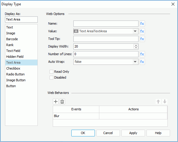
- In the Web Options panel, enter the name, value of the text area in the Name and Value fields.
- In the Tool Tip field, enter the tip you want to show for the text area. Then at server runtime or in HTML results, when you hover the mouse over the text area, the tooltip will be displayed.
- In the Display Width field, specify the maximum number of characters allowed in the text area.
- Check the Read Only option if you would like to set this text area to be read-only.
- Check the Disabled checkbox if you want to make the text area disabled.
- If needed, bind web actions to the text area in the Web Behaviors box.
- Upon finishing, click the OK button to close this dialog.
Checkbox/Radio button
A checkbox or a radio button is a button used to specify the value of a Boolean type option. When the button is selected, the option is enabled, and when unselected, the option is disabled. A checkbox can work alone while two or more radio buttons need to work together to enable only one from multiple options.
The way to insert and define the values of a checkbox and radio button is the same.
-
Do one of the following to insert the checkbox/radio button:
- Drag the button of Checkbox
 or Radio Button
  from the Components panel to the destination.
- Click Insert > Web Controls > Checkbox/Radio Button, then click the mouse button in the destination.
- Right-click the checkbox/radio button and select Display Type from the shortcut menu. The Display Type dialog appears.
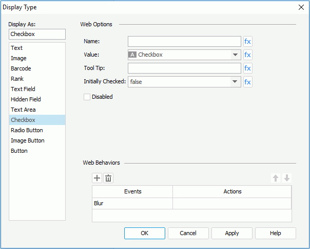
- In the Web Options panel, specify the name, value of the checkbox/radio button in the Name and Value fields.
- In the Tool Tip field, enter the tip you want to show for the checkbox/radio button. Then at server runtime or in HTML results, when you hover the mouse over the checkbox/radio button, the tooltip will be displayed.
- Set Initially Checked to true if you want the checkbox/radio button to be selected by default.
- Check the Disabled checkbox if you want to make the checkbox/radio button disabled.
- If needed, bind web actions to the checkbox/radio button in the Web Behaviors box.
- Upon finishing, click OK to close this dialog.
Image button
An image button allows you to import an image from your local disk as a button.
To insert an image button and define its values:
- Do one of the following to insert the image button:
- Drag the button of Image Button
 from the Components panel to the destination.
- Click Insert > Web Controls > Image Button, then click the mouse button in the destination.
- Right-click the image button and select Display Type from the shortcut menu. The Display Type dialog appears.
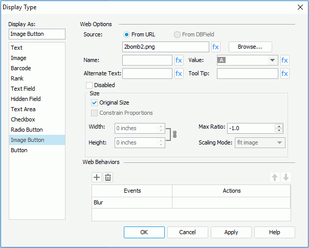
- In the Web Options panel, click the Browse button to specify the image source. For a DBField, formula, or a summary, you can also check the From DBField radio button to make the value of the DBField/formula/summary the image source. If you choose this option, the Decode Type drop-down list is enabled, from which you can specify the type for decoding the image.
- Enter the name, value of the image button in the Name and Value fields.
- Type a string in the Alternate Text field to serve as content when the image cannot be rendered.
- In the Tool Tip field, enter the tip you want to show for the image button. Then at server runtime or in HTML results, when you hover the mouse over the image button, the tooltip will be displayed.
- Check the Disabled checkbox if you want to make the image button disabled.
- Specify the scaling mode of the image button from the Scaling Mode drop-down list, and the maximum scaling ratio in the Max Ratio field. By default the scaling ratio of the image button is not limited. If it is set to any value greater than 0, the actual scaling ratio is less than or equal to it.
- Specify the size of the image button.
- If you choose to use the original size of the image, check the Original Size option.
- If you want to use customized image size, uncheck Original Size, and then set the display width and height of the image in the Width and Height fields. Check the Constrain Proportion option if you want to constrain aspect ratio of the image when setting the width and height.
- If needed, bind web actions to the image button in the Web Behaviors box.
- Upon finishing, click the OK button to close the dialog.
Button
A button can be used for submitting or resetting a form.
To insert a button and define its values:
- Do one of the following to insert the button:
- Drag Button
 from the Components panel to the destination.
- Click Insert > Web Controls > Button, then click the mouse button in the destination.
- Right-click the button and select Display Type from the shortcut menu. The Display Type dialog appears.
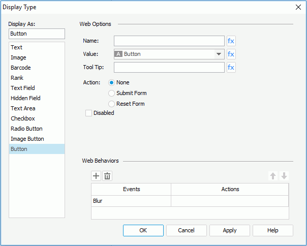
- In the Web Options panel, enter the name, value of the button in the Name and Value fields.
- In the Tool Tip field, enter the tip you want to show for the button. Then at server runtime or in HTML results, when you hover the mouse over the button, the tooltip will be displayed.
- Select the action of the button: None, Submit Form or Reset Form.
- Check the Disabled checkbox if you want to make the button disabled.
- If needed, bind web actions to the button in the Web Behaviors box.
- Upon finishing, click OK to close this dialog.
List/Drop-down list
Lists and drop-down lists are generally called multi-valued containers. They both provide a list of values for users to select from. A list displays values in a box with or without scrollbar and is suitable for showing just a few values. A drop-down list is a good choice for providing a long list of values while taking smaller room and presenting more values at the first sight.
To insert a list/drop-down list and define its values:
-
Do one of the following to insert the list/drop-down list:
- Drag the button of List
 or Drop-down List
  button from the Components panel to the destination.
- Click Insert > Web Controls > List/Drop-down List, then click the mouse button in the destination.
- Right-click the list/drop-down list and select Display Type from the shortcut menu. The Display Type dialog appears.
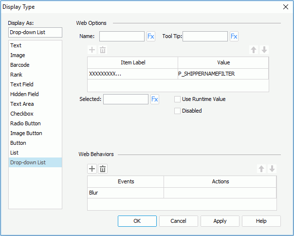
- In the Web Options panel, enter a name for the list/drop-down list in the Name field.
- In the Tool Tip field, enter the tooltip you want to show for the list/drop-down list. Then at server runtime or in HTML results, when you hover the mouse over the list/drop-down list, the tooltip will be displayed.
- Specify the item labels and the value of each item in the items box by inputting some strings as the labels and values respectively.
If you want to use a DBField/formula field/parameter field to control the value, click  in the Value column to insert one with the Insert Fields dialog, and then select the format for the inserted field from the drop-down list in the Item Label column. Check the All radio button in the Insert Field dialog if you want to add an All value to the list/drop-down list. Then when All is selected as value of the list/drop-down list at runtime, all filter actions defined on the list/drop-down list will not take effect, and if you applied some other web action that needs value from the list/drop-down list, a Null value will be returned.
- If the display type is defined as List, you can check the Allow Multiple Selections checkbox if you want to allow multiple items to be selected.
- In the Selected field, specify the selected value for the list/drop-down list.
- If you want to disable the list/drop-down list, check the Disabled option.
- If needed, bind web actions to the list/drop-down list in the Web Behaviors box.
- When done, click OK to apply the settings.
Previous Page Next Page
 behind the text field of the value and then select a formula from the drop-down list. If the given formulas cannot meet your requirements, click the <NEW FORMULA...> item in the list to create one as required.