 Previous Page Next Page
This dialog appears when you right-click a field and select Display Type from the shortcut menu. It helps you to define the display type of the field, which can be one of the following:
OK
Applies the changes and closes the dialog.
Cancel
Does not retain any changes and closes the dialog.
Apply
Applies all changes and leaves the dialog open.
Help
Displays the help document about this feature.
Note: The two display types - List and Drop-down List are only available when the field is a parameter field.
The following are details about options for this display type.

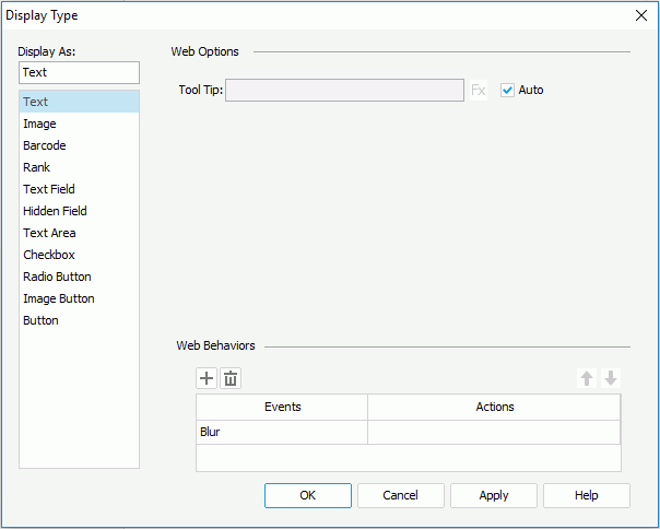
Tool Tip
Specifies the tooltip of the text, which will be shown when you hover the mouse over the text in HTML result or at server runtime. You can also use a formula to control the tooltip.
Specifies some web behaviors to the text.


The following are details about options for this display type.
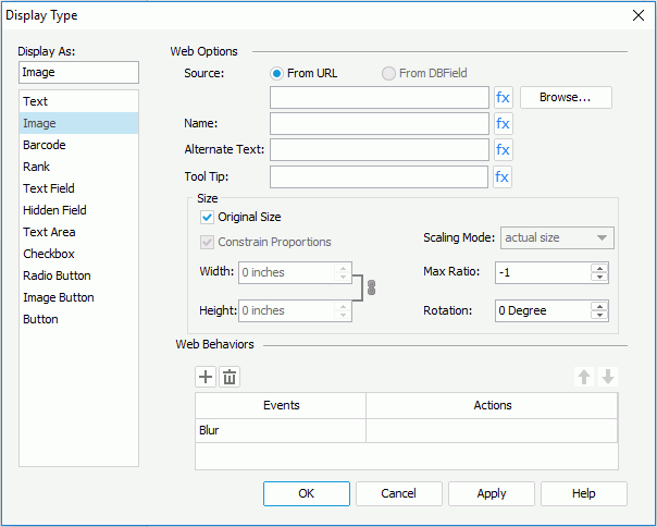
Source
Specifies where the image you want to use comes from.
Name
Specifies the name of the image. You can input the name directly in the text field or use a formula to control it.
Alternate Text
Specifies the alternate text of the image, which will be shown when the image cannot be displayed.
Tool Tip
Specifies the tooltip of the image, which will be shown when you hover the mouse over the image in HTML result or at server runtime.

Indicates the value of an option can be controlled by a formula.
Size
Specifies the size of the image.
Note: When rotating an image, the rectangle that holds the image maintains its original size, which may result in that the image exceeds the field border and therefore the parts that extend outside of the border will be cut off.
Specifies some web behaviors to the image.
The following are details about options for this display type.
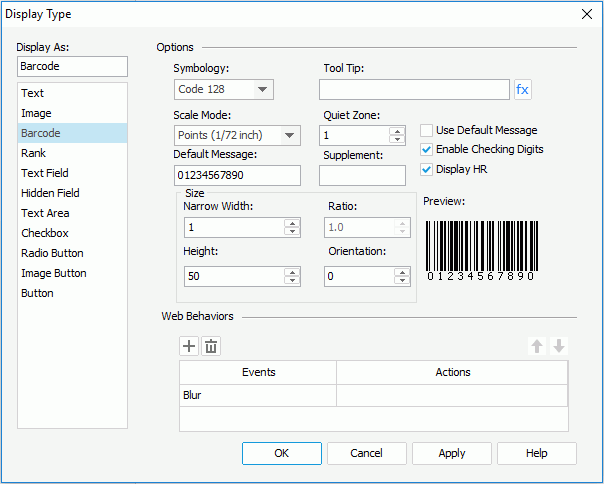
Symbology
Specifies the type of the barcode. It could be UPC A/E, EAN 13/8, CODE 39, CODE 128, CODabar, and Code 128A/128B/128C.
Tool Tip
Specifies the tooltip of the barcode, which will be shown when you hover the mouse over the barcode in HTML result or at server runtime. You can also use a formula to control the tooltip.
Scale Mode
Specifies the unit for the values of Quiet Zone, Narrow Width, Supplement, Height and Ratio.
Quiet Zone
Specifies the space around the barcode.
Default Message
Specifies the default value for the barcode, which will be used for the barcode in design mode.
Supplement
Specifies the supplement for the barcode. The barcode types, Code 39, Code 128/128A/128B/128C and Codabar, don't have supplements.
Use Default Massage
If checked, the value you specify in the Default Message field will be used as the barcode value when you view the report result. Otherwise, the value will only be used in design mode.
Enable Checking Digits
Specifies whether to include check digits in the barcode.
Display HR
Specifies whether to display the barcode numbers together with the barcode. Enabled only for Code 39, Code 128/128A/128B/128C and Codabar.
Size
Specifies the size of the barcode.
Preview
Displays the format of the selected symbology.
Specifies some web behaviors to the barcode.
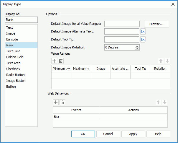
The following are details about options for this display type.
Default Image for All Value Ranges
Specifies the default image for all value ranges, which will be applied when the value of a field does not fall into any of the defined ranges. You can click the Browse button to specify the image path or input the path and file name of the image directly in the text field.
Default Image Alternate Text
Specifies the alternate text for the default image, which will be shown when the default image cannot be displayed.
Default Tool Tip
Specifies the tooltip of the default image, which will be shown when you hover the mouse over the image in HTML result or at server runtime.
Indicates the value of an option can be controlled by a formula.
Default Image Rotation
Specifies the default image's rotation angle, in degrees. The following is the meaning of different values:
Note: When rotating an image, the rectangle that holds the image maintains its original size, which may result in that the image exceeds the field border and therefore the parts that extend outside of the border will be cut off.
Value Range
Specifies the value ranges.
Specifies some web behaviors to the rank.
The following are details about options for this display type.
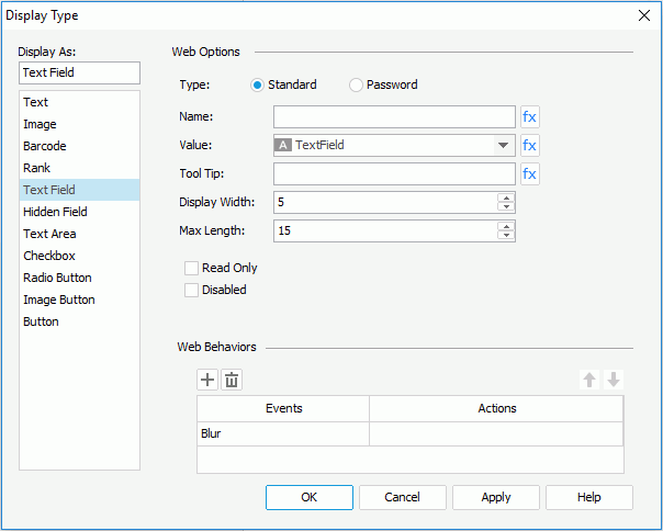
Type
Specifies the type of the text field.
Name
Specifies the name of the text field.
Value
Specifies the value of the text field.
Tool Tip
Specifies the tooltip of the text field, which will be shown when you hover the mouse over the text field in HTML result or at server runtime.
Indicates the value of an option can be controlled by a formula.
Display Width
Specifies the display width of the text field.
Max Length
Specifies the maximum length of the string that is allowed in the text field.
Read Only
Specifies whether to make the field read-only to others.
Disabled
Specifies whether the text field is disabled or enabled.
Specifies some web behaviors to the text field.
A hidden field is visible only in design mode. The following are details about options for this display type.
Name
Specifies the name of the hidden field.
Value
Specifies the value of the hidden field.
Indicates the value of an option can be controlled by a formula.
Specifies some web behaviors to the hidden field.
The following are details about options for this display type.
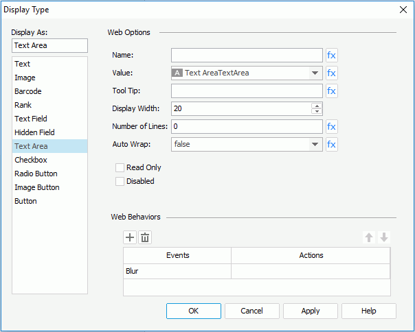
Name
Specifies the name of the text area.
Value
Specifies the value of the text area.
Tool Tip
Specifies the tooltip of the text area, which will be shown when you hover the mouse over the text area in HTML result or at server runtime.
Display Width
Specifies the display width of the text area.
Number of Lines
Specifies the number of lines that is allowed in the text area.
Auto Wrap
Specifies whether to wrap the text in the text area.
Indicates the value of an option can be controlled by a formula.
Read Only
Specifies whether to make the text area read-only to others.
Disabled
Specifies whether the text area is disabled or enabled.
Specifies some web behaviors to the text area.
The following are details about options for this display type.
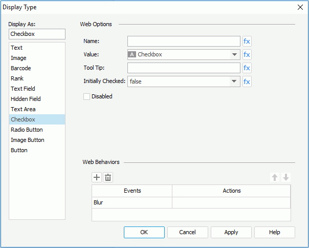
Name
Specifies the name of checkbox.
Value
Specifies the value of the checkbox.
Tool Tip
Specifies the tooltip of the checkbox, which will be shown when you hover the mouse over the checkbox in HTML result or at server runtime.
Initially Checked
Specifies whether or not the checkbox is selected by default.
Indicates the value of an option can be controlled by a formula.
Disabled
Specifies whether the checkbox is enabled or disabled.
Specifies some web behaviors to the checkbox.
The following are details about options for this display type.
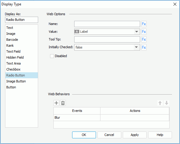
Name
Specifies the name of radio button.
Value
Specifies the value of the radio button.
Tool Tip
Specifies the tooltip of the radio button, which will be shown when you hover the mouse over the radio button in HTML result or at server runtime.
Initially Checked
Specifies whether or not the radio button is selected by default.
Indicates the value of an option can be controlled by a formula.
Disabled
Specifies whether the radio button is enabled or disabled.
Specifies some web behaviors to the radio button.
The following are details about options for this display type.
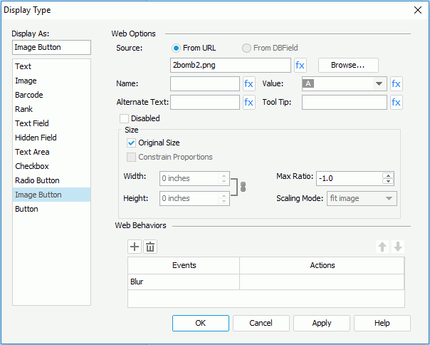
Source
Specifies where the image button you want to use comes from.
Name
Specifies the name of the image button.
Value
Specifies the value of the image button.
Alternate Text
Specifies the alternate text of the image, which will be shown when the image cannot be displayed.
Tool Tip
Specifies the tooltip of the image button, which will be shown when you hover the mouse over the image button in HTML result or at server runtime.
Indicates the value of an option can be controlled by a formula.
Disabled
Specifies whether the image button is disabled or enabled.
Size
Specifies the size of the image.
Specifies some web behaviors to the image button.
The following are details about options for this display type.
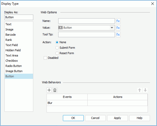
Name
Specifies the name of the button.
Value
Specifies the value of the button.
Tool Tip
Specifies the tooltip of the button, which will be shown when you hover the mouse over the button in HTML result or at server runtime.
Indicates the value of an option can be controlled by a formula.
Action
Specifies the default action that will happen when the button is clicked.
Disabled
Specifies whether the button is disabled or enabled.
Specifies some web behaviors to the button.
The following are details about options for this display type.
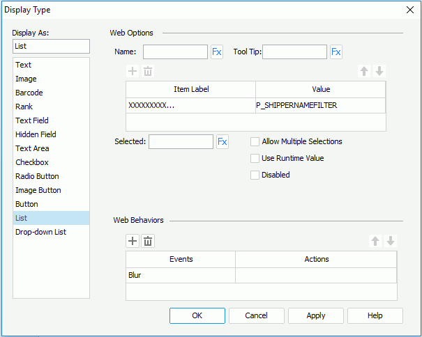
Name
Specifies the name of the list.
Tool Tip
Specifies the tooltip of the list, which will be shown when you hover the mouse over the list in HTML result or at server runtime.
Adds a new item in the list.
Removes the selected item.
Moves the selected item up a step.
Moves the selected item down a step.
Item Label
Specifies the display text or format of the item value. Select the desired one from the drop-down list.
Value
Specifies the item value.
Selected
Specifies the value that will be selected in the list by default.
Indicates the value of an option can be controlled by a formula.
Allow Multiple Selections
Specifies whether to allow selecting multiple items in the list at the same time.
Use Runtime Value
When changing the display type of a parameter to list, you can check this option to use the runtime value as the selected value of the list.
Disabled
Specifies whether the list is disabled or enabled.
Specifies some web behaviors to the list.
The following are details about options for this display type.
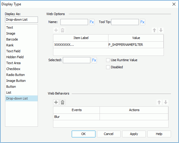
Name
Specifies the name of the drop-down list.
Tool Tip
Specifies the tooltip of the drop-down list, which will be shown when you hover the mouse over the drop-down list in HTML result or at server runtime.
Adds a new item in the drop-down list.
Removes the selected item.
Moves the selected item up a step.
Moves the selected item down a step.
Item Label
Specifies the display text or format of the item value. Select the desired one from the drop-down list.
Value
Specifies the item value.
Selected
Specifies the value that will be selected in the drop-down list by default.
Indicates the value of an option can be controlled by a formula.
Use Runtime Value
When changing the display type of a parameter to drop-down list, you can check this option to use the runtime value as the selected value of the drop-down list.
Disabled
Specifies whether the drop-down list is disabled or enabled.
Specifies some web behaviors to the drop-down list.