 Previous Page Next Page
Editing Range Groups on Category Values
Data on the category axis of a chart can be divided into different range groups and separated by separating lines, and you can customize the data labels displayed for each range group.
The following example shows the usage in detail.
- Open the catalog file SampleReports.cat in
<install_root>\Demo\Reports\SampleReports.
- Create a web report.
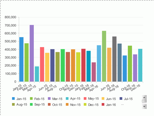
- Insert a chart in the web report which is based on WorldWideSalesBV in Data Source 1, displays in the Clustered Bar 2-D chart type, shows Sales Month on X-Axis and Total Sales on Bar Length.
- View the chart and it appears as follows:
- Click the Design tab to return to the design mode.
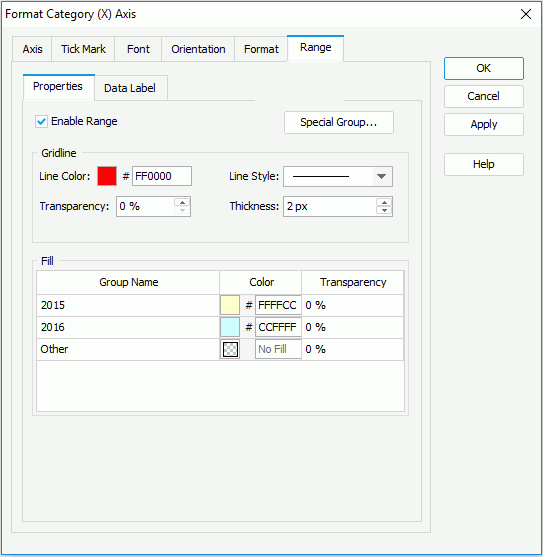
- Right-click the chart and select Format Axes > Format Category (X) Axis from the shortcut menu. The Format Category (X) Axis dialog appears.
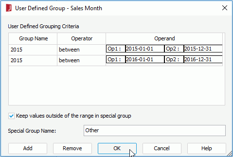
- Go to the Range > Properties tab, check the Enable Range option and then click the Special Group button to display the User Defined Group dialog.
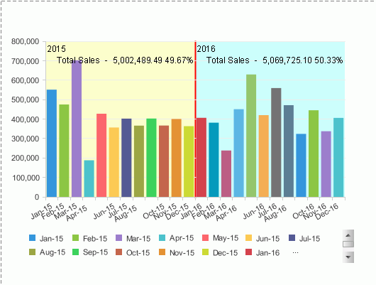
- Define two range groups as follows and click OK.
- In the Gridline box, specify the line color as #FF0000 and thickness as 2 px for the separating line, then in the Fill box, specify the background colors of the 2015 and 2016 range groups as #FFFFCC and #CCFFFF.
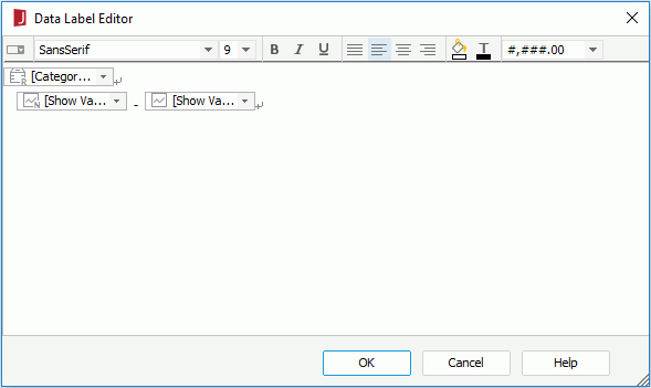
- Click the Data Label sub tab, check the Show Data Label option and then click the Edit Data Labels button to display the Data Label Editor. You can see there are three data labels which represent the category ranges, the summary field names and values respectively by default. Click OK.
- Select value and percent from the Value Label Type drop-down list. Click OK.
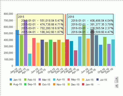
- Click the View tab to preview the chart. The category values are now divided into two range groups with different background colors. In each range group, the data labels display the year information and the total sales of each year as well as the percentage of the total sales each year occupies.
- Click the Design tab to return to the design mode. This time we will format some properties of the areas that display the data labels on the range groups and make the data labels show total sales of each month instead.
- Right-click the chart and select Format Axes > Format Category (X) Axis from the shortcut menu to open the Format Category (X) Axis dialog again.
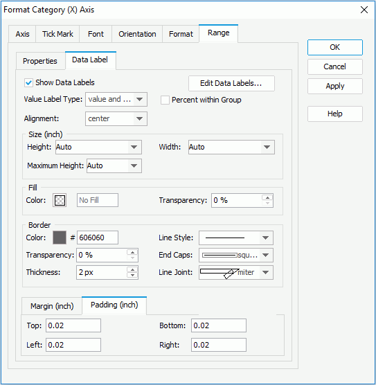
- Go to the Range > Data Label tab, in the Border box, specify Color as #606060, select the first item from the Line Style drop-down list, set Thickness to 2 px.
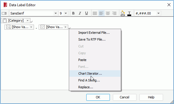
- Click the Edit Data Labels button to display the Data Label Editor.
- Select [Category] from the first drop-down list of the last iterator.
- Click on the right of the last drop-down list to select the last iterator, then right-click the iterator and
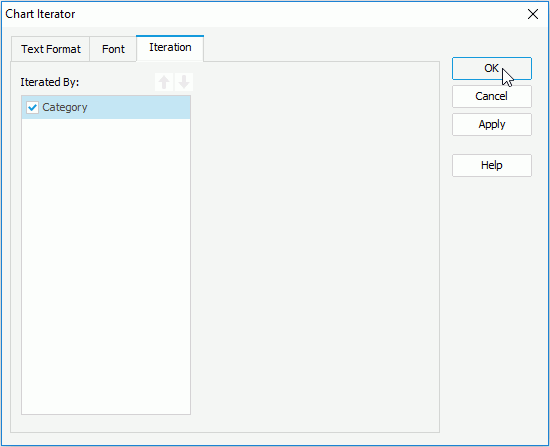
select Chart Iterator from the shortcut menu to display the Chart Iterator dialog.
- Check the Category option in the Iterated By box and click OK.
- Click OK in the Data Label Editor and Format Category (X) Axis dialog respectively to close them and apply the settings.
- Resize the chart and save the report.
- Click the View tab to view the chart again.
The border of the data label areas is displayed and the data labels now show the total sales of each month and the percentage each month occupies. You can put the mouse over the data labels when they cannot be completely displayed to get the full text.
Previous Page Next Page