 Previous Page Next Page
Visual Analysis is an in-context analysis tool to visualize the result of every step of your work. Simply by dragging and dropping data fields onto the layout module, you are able to visually analyze data in either text or graphs.
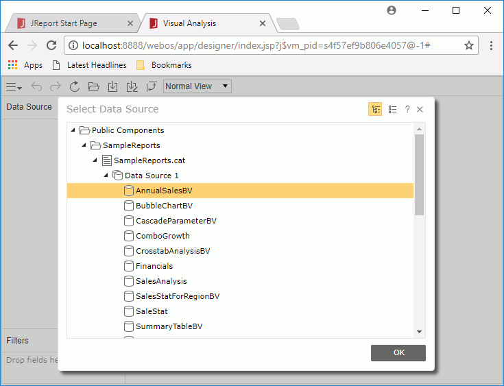
Business views are the data sources used in Visual Analysis.
Note: A Visual Analysis license is required in order to perform this track. If you do not have the license, please contact your Jinfonet Software account manager to obtain one first.
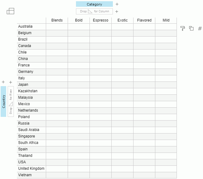
The group  and aggregation
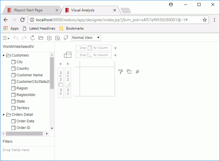
  fields in the selected business view are listed in the resource panel on the left. You can drag them to the data presentation area on the right to perform analysis.
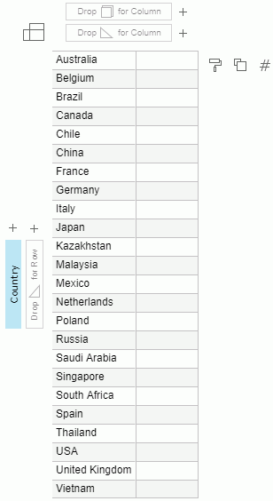
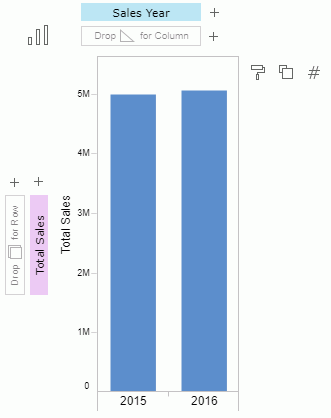
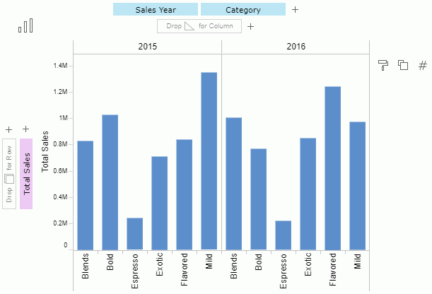
 as the row header.
 as the column header.
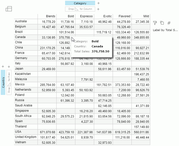
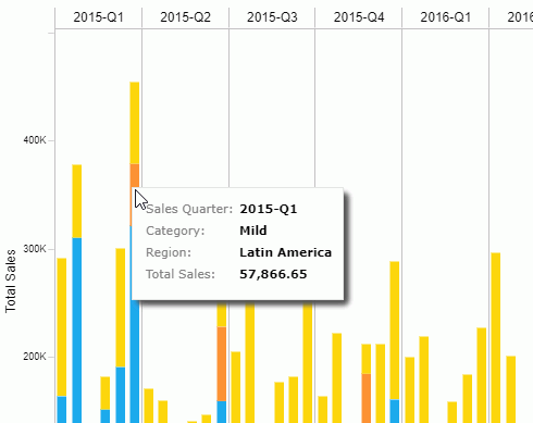
 in the legend section. The report shows as follows. You can hover the mouse on any value to get the detailed information:
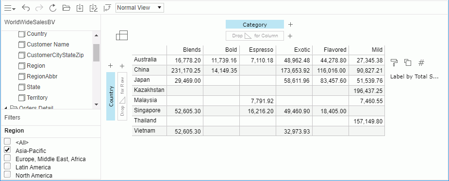
Next we will make use of the Filter panel to filter data in the report.
 on the toolbar.
In this task we will start a new Visual Analysis session to analyze data by graphs.
 and select New from the drop-down menu. A new Visual Analysis tab is displayed.
  , then select Bar
  from the drop-down list.
  .
.
.
 beside a data control box to add a field from the resource list).
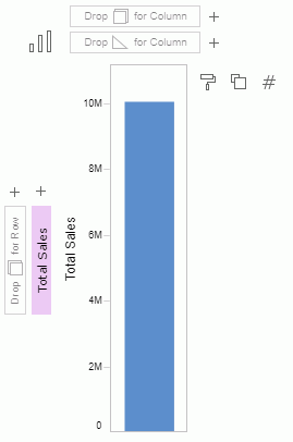
The report appears as follows:
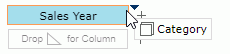
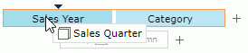
We want to analyze data of the two sales years by quarter, so next we will replace Sales Year with Sales Quarter.
In the control box sections, you can also drag and drop a field to the right/left or top/bottom to change the display order of the field, or drag a field out of its control box to remove it.
Next we will try another important feature of Visual Analysis, analyzing with the legend.
 in the legend section. Data of each region is marked by different color. You can click to customize the colors if you want. Here we keep the default color pattern.
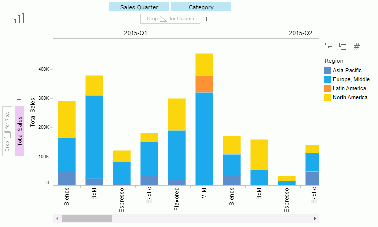
The report is displayed with a scrollbar which is not convenient for comparing data. We can change the fit setting to improve the layout.
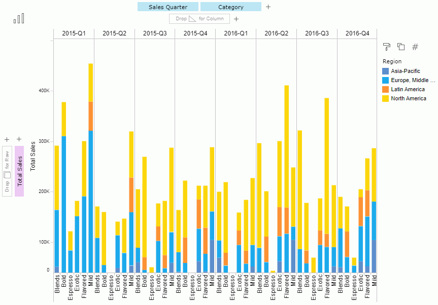
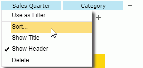
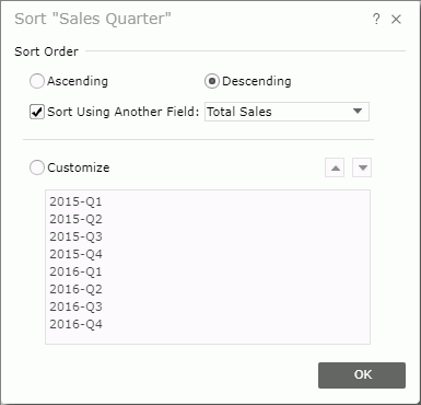
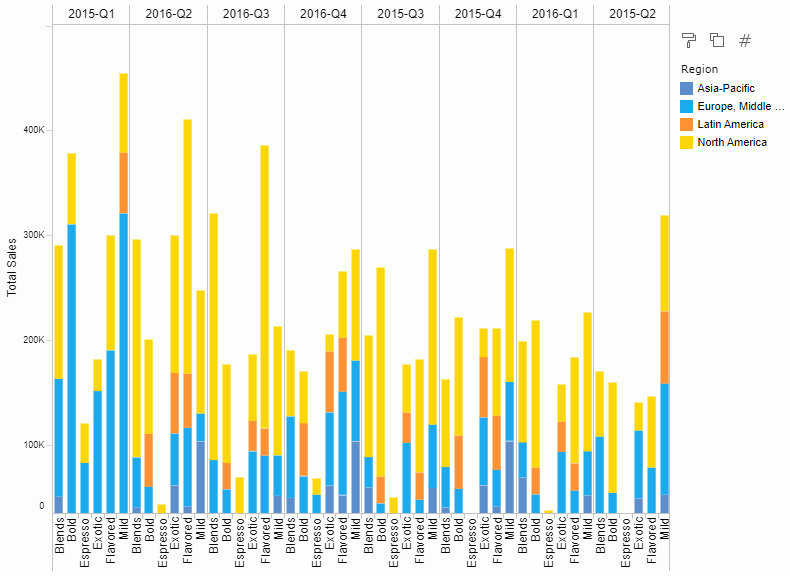
Visual Analysis supports the Sort feature on the fields used for grouping the columns and rows. Next we want to sort the sales quarters based on their total sales in descending order.
The report now displays as follows:
Lastly we will change the data display type to Pie so that it is easy to find out which region sales the most.
and then select Pie  from the drop-down list.
 in the legend section. The report changes to below.
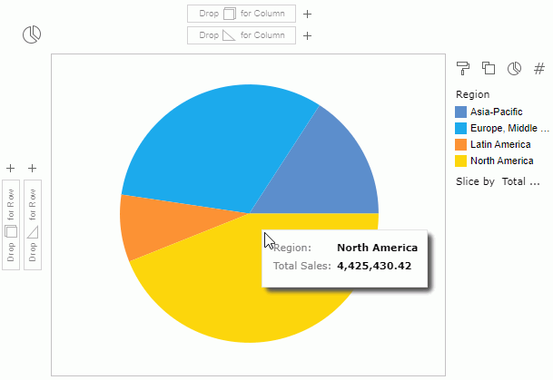
We can see that North America occupies the largest amount of the total sales.
on the toolbar to save the data state as an analysis template into the server resource tree.