 Previous Page Next Page
Lesson 3: Creating and Performing Data Analysis on Page Reports
Using Page Report Wizard you can create a single component page report which is viewed in Page Report Studio. Page Report Studio provides the user a page mode view of the report very similar to a printed report.
There are several types of reports in the Page Report Wizard which collect information for you: blank (no component), banded, crosstab, table, and chart. You can add more components to a report after it is generated by the wizard. In this lesson, we will create a page report that contains three report tabs, and then perform data analysis on them one by one.
This lesson contains the following tasks:
Task 1: Create a banded report
Task 2: Create a table report
Task 3: Create a crosstab report
Task 4: Insert a chart
Task 5: Analyze data of the banded object
Task 6: Analyze data of the table
Task 7: Analyze data of the crosstab
Task 8: Analyze data of the chart
Task 1: Create a banded report
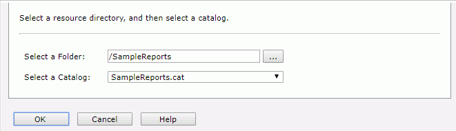
- On the JReport Server Start Page, click Page Reports in the Create category.
- In the displayed page, select the SampleReports folder and SampleReports.cat catalog file, then click OK.
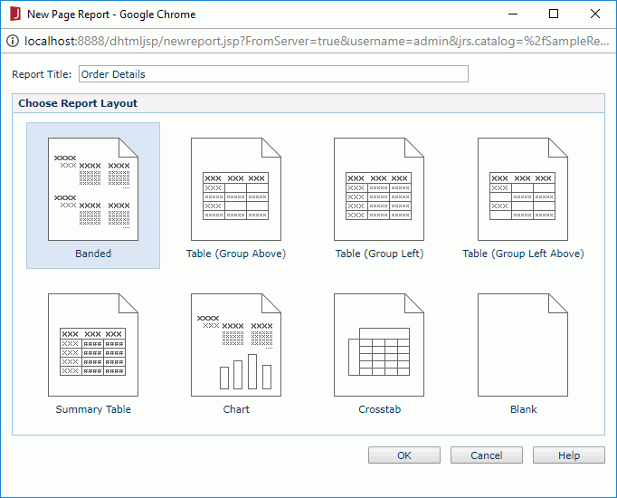
- In the New Page Report dialog, type Order Details in the Report Title text field, select Banded in the layout box, then click OK.
The Banded Wizard appears.
- In the Data screen, select WorldWideSalesBV in Data Source 1 from the Available Data Resources box.
Click Next.
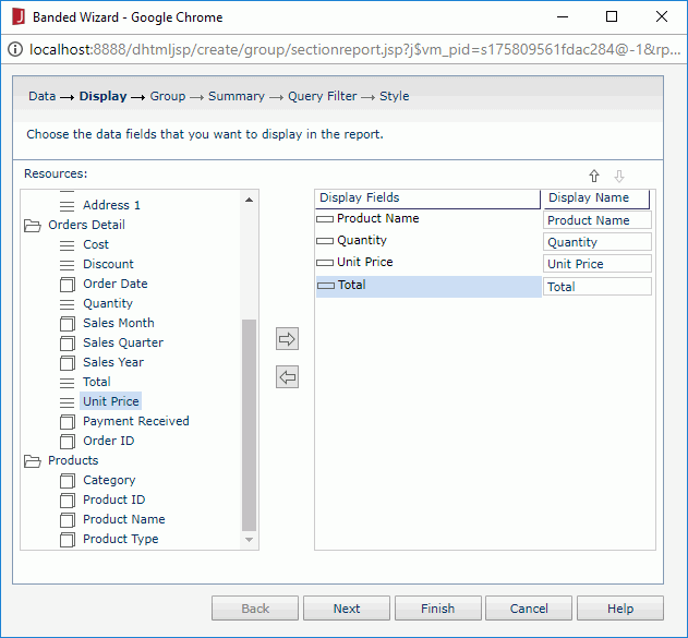
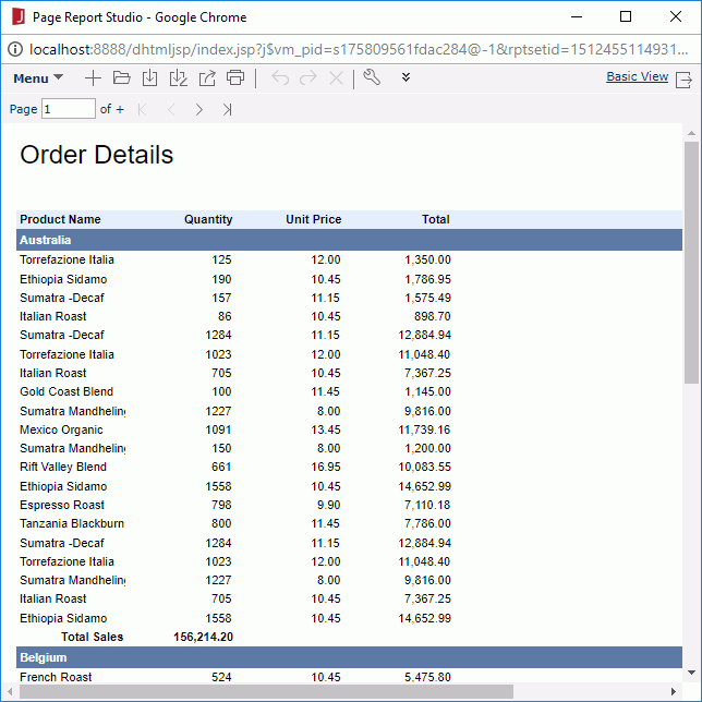
- In the Display screen, expand the Products category in the Resources box, add Product Name as a detal field to the right box, then expand the Orders Detail category and add Quantity, Unit Price and Total one by one to the right box. Click Next.
- In the Group screen, add Country as the group by field, keep Ascend as the sort manner, and then click Next.
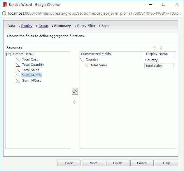
- In the Summary screen, select the Country group in the right box, then add Total Sales to summarize the total sales for each order. Click Next.
- Skip the Query Filter screen and click Next.
- In the Style screen, set the style to ClassicBlue, then click Finish to create the report.
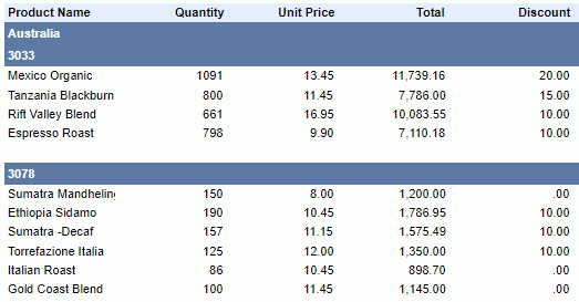
The report displays as follows in Page Report Studio:
- Click Menu > File > Rename Report Tab.
- In the Rename Report Tab dialog, enter OrderDetails as the report tab name, then click OK.
- Click the Save button
 on the toolbar.
- In the Save As dialog, type CustomerOrders.cls in the File Name text field, then click OK to save the report into the Public Reports > SampleReports folder in the server resource tree.
Task 2: Create a table report
- In the current open report window, click the New Report Tab button
 on the toolbar.
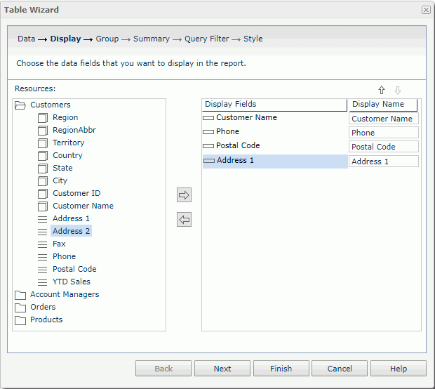
- In the New Report Tab dialog, enter Customer Information in the Report Title text field, select Table (Group Above) in the layout box, then click OK. The Table Wizard appears.
- In the Data screen of the wizard, select CoffeeSalesUSA in Data Source 1, then click Next.
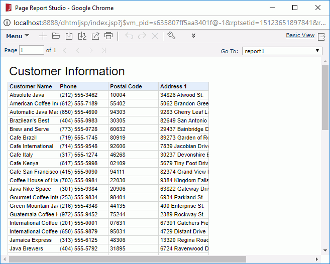
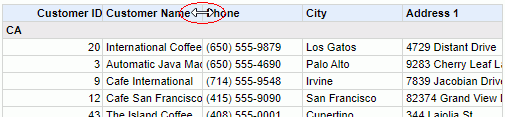
- In the Display screen, add Customer Name, Phone, Postal Code and Address 1 one by one as the detail fields in the table. Click Next.
- Skip the Group, Summary and Query Filter screens.
- In the Style screen, set the style to ClassicBlue, then click Finish to create the table report.
The table report appears as follows:
- Click Menu > File > Rename Report Tab to rename the report tab as CustomerInfo.
- Click the Save button on the toolbar. In the Save Report Template dialog, click Yes to save the report.
Task 3: Create a crosstab report
- In the current open report window, click the New Report Tab button on the toolbar.
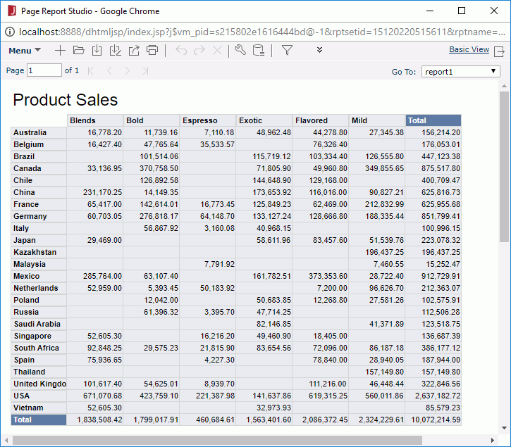
- In the New Report Tab dialog, type Product Sales in the Report Title text field, select Crosstab in the layout box, then click OK. The Crosstab Wizard appears.
- In the Data screen, select WorldWideSalesBV in Data Source 1 and then click Next.
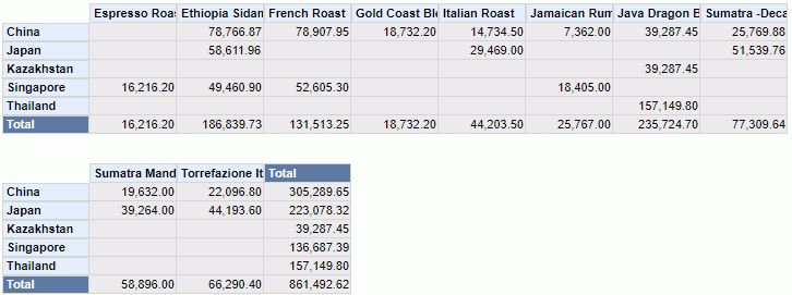
- In the Display screen, add Country from the Customers category in the Resources box as the row field and Category from the Products category as the column field (keep Ascend as the sort manner for both columns and rows), then add Total Sales from the Orders Detail category as the summary field. Click Next.
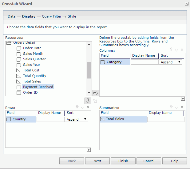
- Skip the Query Filter screen. Click Next.
- In the Style screen, set the crosstab style as ClassicBlue, then click Finish to create the crosstab report.
The crosstab report appears as follows:
- Click Menu > File > Rename Report Tab to rename the report tab as ProductSales.
- Click on the toolbar. In the Save Report Template dialog, click Yes to save the report.
Task 4: Insert a chart
In this task, we will insert a chart below the crosstab created in Task 3.
- Click Menu > View > Toolbox on the toolbar to display the Toolbox panel.
- Drag Chart to place it under the last row of the crosstab.
The Chart Wizard appears.
- In the Data screen, select WorldWideSalesBV in Data Source 1, then click Next.
- In the Type screen, keep the default chart type Clustered Bar 2-D and click Next.
- In the Display screen, add Sales Quarter from the Orders Detail category to the Category box and Product Type in the Products category to the Series box, then add Total Sales in the Orders Detail category to the Show Values box.
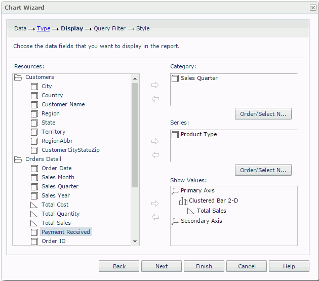
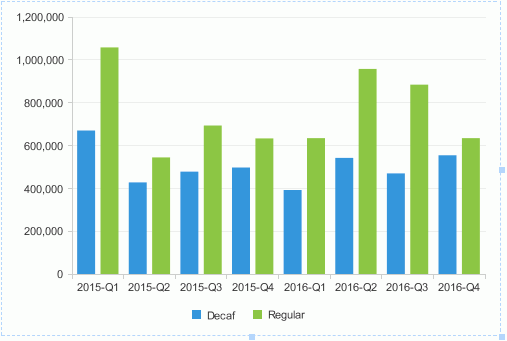
- Click Finish to create the chart. The chart appears as follows:
- Click on the toolbar. In the Save Report Template dialog, click Yes to save the report.
Task 5: Analyze data of a banded object
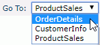
- In the current report window, click OrderDetails from the Go To drop-down list on the toolbar to switch to this report tab.
We want to make the orders in each country further grouped by order ID, so firstly we need to add another group into the banded object.
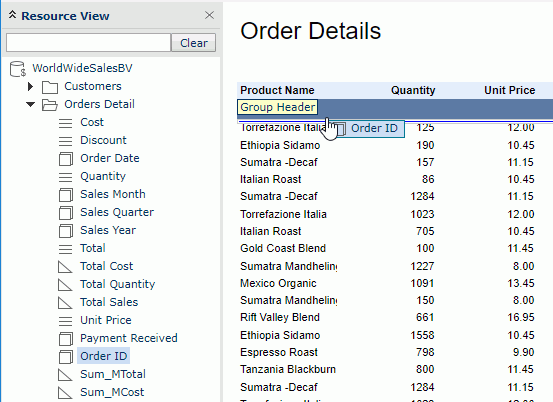
- Close the Toolbox panel on the left, then click Menu > View > Resource View to display the Resource View panel.
- Expand the Orders Detail category in the panel, drag Order ID below the Australia group header and drop it when a blue line appears and a tip Group Header shows up.
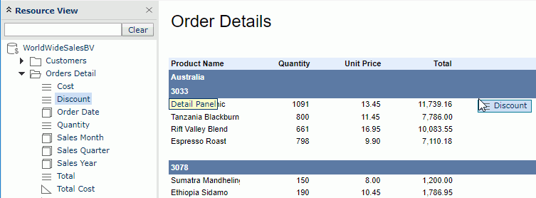
Next we want to add a column about the discount of each product.
- Drag Discount from the Resource View panel to the detail panel of the banded object:
The new group and detail column display in the banded object as follows:
Now let's do some adjustments to improve the appearance of the banded object.
- Right-click the Discount label in the banded header and select Properties from the shortcut menu. The Label Properties dialog appears.
- In the General tab, edit the Width property to 1.04, then click the Font tab and change Horizontal Alignment to right. Click OK to apply the property settings.
The Discount label is now aligned with the values in the same column.
There are two group levels in the banded object, to easily distinguish them we will change the background color of the Order ID group.
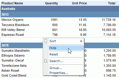
- Right-click any of the Order ID group header panel, the panel of 3033 for example, then click Properties on the shortcut menu.
- In the General tab of the Banded Panel Properties dialog, set the Background property to #668cb2, then click OK to confirm.
There is a blank panel before each new order ID begins. This is the group footer panel of the Order ID group. Since we will not add any data to the panel, next we will hide it.
- Right-click any of the Order ID group footer panel, the blank footer of 3033 for example, then select Hide from the shortcut menu.
After making the appearance adjustments the banded object looks as follows:
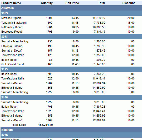
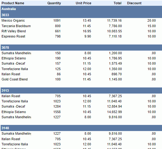
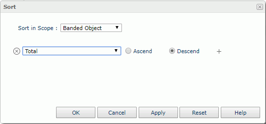
Next, we will sort and filter the banded object. The totals will be sorted in descending order for each group. The records will be filtered by discount to show orders in which the discount is 10 point only.
- Click the Sort button
 on the toolbar to open the Sort dialog.
- In the Sort dialog, choose Total from the field drop-down list, check the sorting manner as Descend, and then click OK to apply the settings.
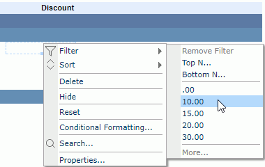
- Right-click any value in the Discount column, then on the shortcut menu, click Filter > 10.00.
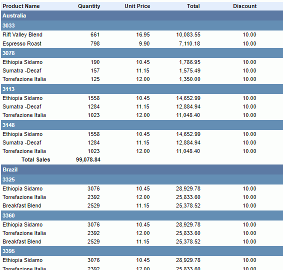
The banded object fianlly turns out as follows:
- Click on the toolbar. In the Save Report Template dialog, click Yes to save the report.
In the above steps, we used two ways to sort and filter the report results: one by dialog and the other by right-click menu command. In fact, both operations can be achieved by either way.
Task 6: Analyze data of a table
- Select CustomerInfo from the Go To drop-down list on the toolbar to switch to this report tab.
First we want to add more columns to the table. We can do this either by dragging fields from the Resource View panel or using dialog.
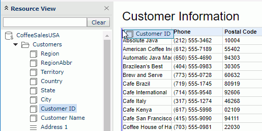
- In the Resource View panel, expand the Customers category, then drag Customer ID to the top left boundary of the Customer Name column and drop it when a vertical blue line appears on the left of Customer Name. Click OK in the prompt message to use the group object as a detail object.
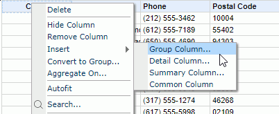
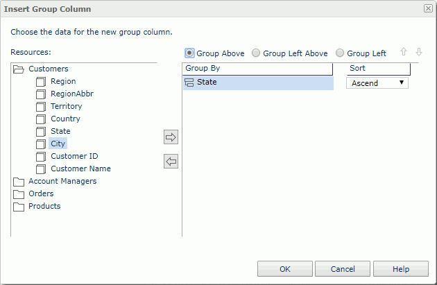
- Right-click any label in the table header, Customer ID for example and select Insert > Group Column from the shortcut menu.
- In the Insert Group Column dialog, select State in the Resources box as the group by field and add it to the right box, select the group position as Group Above, keep the default sort order, then click OK to insert the column.
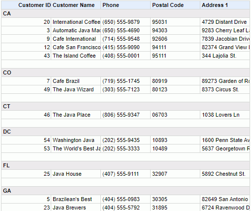
The table is now grouped by state as follows:
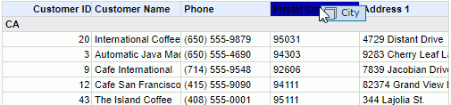
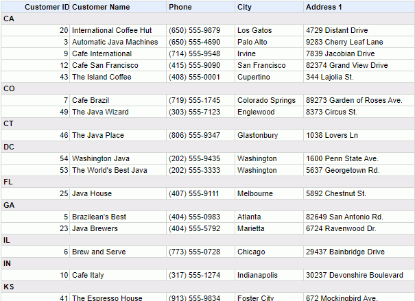
We consider the postal code information is not very useful. We want to replace the column with City.
- Drag City in the Customers category from the Resource View panel to the Postal Code column label and drop it when the label is highlighted:
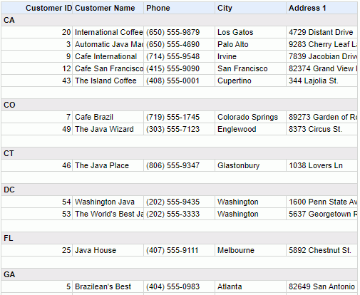
The table changes to:
Lastly we want to make some adjustments to improve the table appearance. We will resize the Customer Name and Address 1 columns to make values in the columns displayed entirely and hide the blank group footer.
- Move the mouse pointer to the right boundary of the Customer Name column header, when a double headed arrow appears, drag the boundary to the right.
- Resize the Address 1 column in the same way.
- Click in the blank group footer row, when the icon
 appears at the top right of the table, right-click the icon, then on the shortcut menu, point to Show and click Table Group Footer on the submenu.
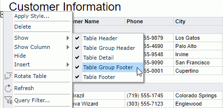
The table finally changes to:
- Click on the toolbar. In the Save Report Template dialog, click Yes to save the report.
Task 7: Analyze data of a crosstab
In this task, we will demonstrate the Drill feature of Page Report Studio based on the crosstab in the ProductSales report tab. JReport supports four types of drill actions: drill-up, drill-down, drill-to and drill-to-by-value. They can be performed on crosstabs, charts, grouped tables and banded objects. However to perform the drill-up and drill-down actions on a data component, the business view used by the component should contain predefined hierarchies, so that you are able to drill from one group level up or down to another within a hierarchy.
- Select ProductSales from the Go To drop-down list on the toolbar to switch to the report tab, which contains a crosstab and a chart.
Since Country is a middle level predefined in the hierarchy Geography of WorldWideSalesBV, we can drill it up or down to the adjacent level.
- Right-click any country in the row header, then on the shortcut menu click Drill Up > Region.
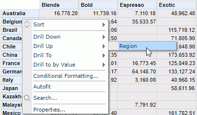
The crosstab refreshes to show as follows:
Next we want to drill down from Region to Country, however it is not simply a reversed process of drilling up from Country to Region. When you drill down to a lower group level, JReport will apply the currently selected value as a filter condition to show its data in the lower group level only.
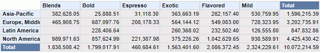
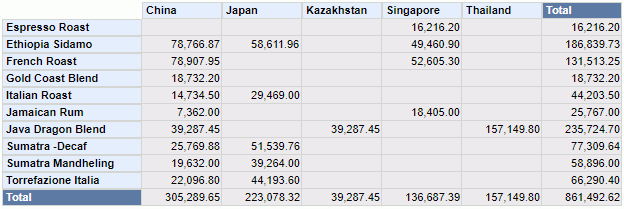
- Right-click Asia-Pacific in the row header and select Drill Down > Country from the shortcut menu.
Now only countries in Asia-Pacific is displayed in the row header:
We can further drill Country down to State and then to City in this way if necessary. Here let's leave the crosstab as it is and try the other two drill actions.
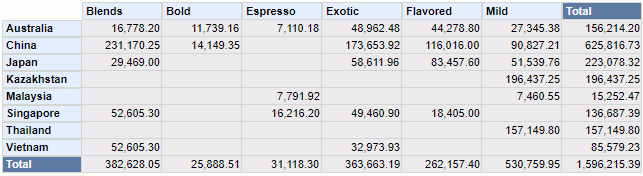
- Right-click any product category in the column header, then on the shortcut menu click Drill To > Sales Year.
The crosstab is regenerated to show sales in the Asia-Pacific countries in 2015 and 2016:
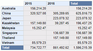
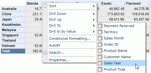
- Right-click 2016 in the column header and select Drill to by Value > Product Name from the shortcut menu. The crosstab now shows each product's sales in the Asia-Pacific countries in 2016.
Lastly we want to rotate the crosstab, that is to switch its column and row headers so that the crosstab will not be split into two.
- Click any aggregation cell in the crosstab to select the crosstab, then click the Rotate button
 on the toolbar.
- Resize the crosstab row header by dragging its right boundary to the right to make values in the row header completely displayed.
The crosstab finally changes to:
- Click on the toolbar. In the Save Report Template dialog, click Yes to save the report.
Task 8: Analyze data of a chart
Now let's focus on the chart below the crosstab in the ProductSales report tab. In JReport, a chart can be converted to a crosstab, and vice versa. We will convert the chart to a crosstab first.
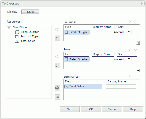
- Right-click on the chart and select To Crosstab from the shortcut menu. The To Crosstab dialog appears.
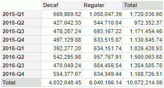
- The Resources box in the Display tab lists the fields used in the crosstab. Add Product Type to the Columns box, Sales Quarter to the Rows box, and Total Sales to the Summaries box. Click OK to generate the crosstab.
The chart is converted to a crosstab as follows:
Next we want to return the crosstab to chart to go on analyzing with chart. We want to change the chart type to line chart.
- Click the Undo button
 on the toolbar to cancel the operation of converting chart to crosstab.
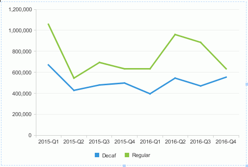
- Right-click on the chart, and on the shortcut menu, click Chart Type > Line > Line 2-D. The chart appears as follows:
In Page Report Studio, the definition of a chart can be changed at any time. Next we will use different type and fields to re-define the chart.
- Right-click anywhere in the chart except the legend and click Format Chart on the shortcut menu. The Chart Definition dialog appears.
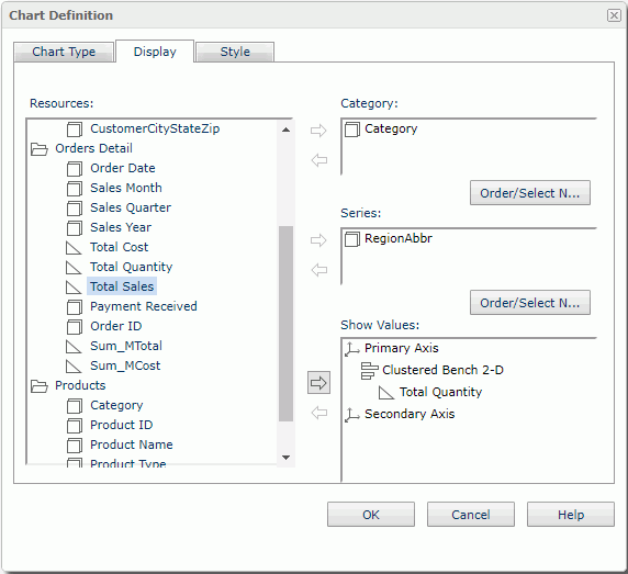
- In the Type tab, select the Bench chart type, keep the default sub type as Clustered Bench 2-D.
- Click the Display tab, remove the fields in the Category and Series boxes respectively, then expand the Products category in the Resources and add Category to the Category box, add RegionAbbr in Customers to the Series box, and Total Quantity in Orders Detail to the Show Values box. Click OK to create the chart.
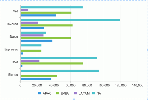
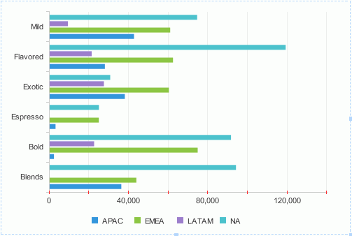
The new bench chart displays as follows:
Properties of the elements in a chart, such as the platform, paper, legend and axes, can be customized using corresponding format dialogs to suit your requirements. Next we will edit some properties of the tick marks on the Y axis to briefly introduce the Chart Format feature.
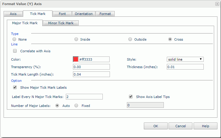
- Right-click anywhere in the chart except the legend and select Format Axis > Format Value (Y) Axis from the shortcut menu.
- In the Format Value (Y) Axis dialog, switch to the Tick Mark tab, in the Major Tick Mark sub tab, check Cross , enter #ff3333 in the Color text box, specify to show data labels every 2 tick marks. Click OK to apply the properties.
The tick marks and data labels on the Y axis apply the new properties and display as follows:
- Click on the toolbar. In the Save Report Template dialog, click Yes to save the report.
Previous Page Next Page