 Previous Page Next Page
Lesson 2: Creating a Web Report Using Wizard
In this lesson, we will create a web report using the Web Report Wizard, that is using the traditional way of Web Report Studio. The report will contain three data components: a table, a crosstab and a chart. After the report is created, we will use the powerful analysis features of Web Report Studio to analyze data in each component.
This lesson contains the following tasks:
Task 1: Create a web report using the wizard
Task 2: Work with the crosstab
Task 3: Work with the chart
Task 4: Work with the table
Task 5: Apply a filter
Task 1: Create a web report using the wizard
- On the JReport Server Start Page, click Profile in the Manage category.
- In the Profile > Customize Server Preferences > General tab, select the Yes checkbox for Use Wizard for Web Report Studio. Click OK to save the setting.
Then in the prompt message box, click OK.
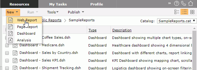
- Click Resources on the system toolbar to switch to the page, then go to the Public Reports > SampleReports folder.
- Click New > Web Report on the task bar. The Web Report Wizard appears.
- In the Page screen of the wizard, select Blank, in the Label text box, input Sales Performance, then click Next.
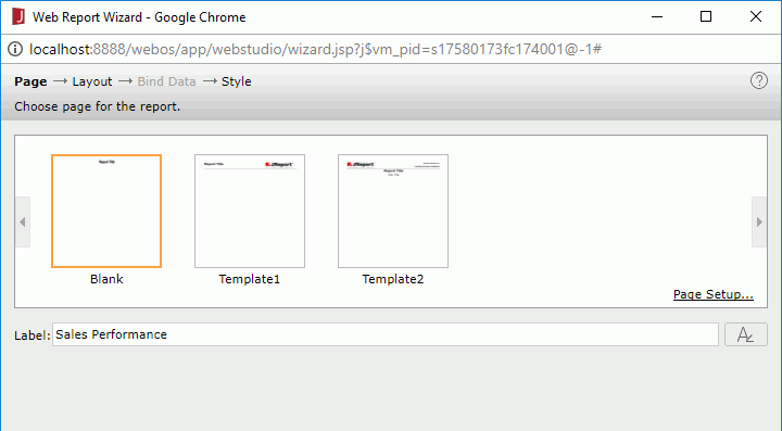
You can also select from the other two templates if you want, with which you can customize the company logo and company name.
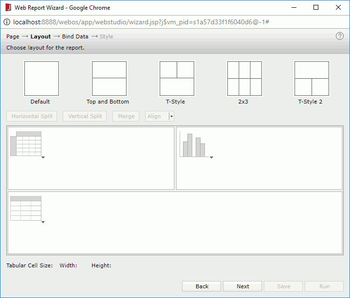
- In the Layout screen, select the T-Style layout. In the first tabular row, click the Click here to select component link in the left cell and select Crosstab from the drop-down menu. Select Chart for the right cell and Table for the bottom cell.
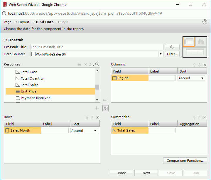
- Click Next to go to the Bind Data screen to define data for the three components one by one. First define the crosstab: from the Data Source drop-down list, select WorldWideSalesBV in Data Source 1, add Region to the Columns box, Sales Month to the Rows box, and Total Sales to the Summaries box.
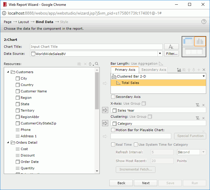
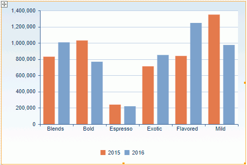
- Click Next to define the chart: keep the business view in the Data Source text box unchanged to use the same data source as the crosstab, add Sales Year to the X-Axis box, Total Sales to the Bar Length box and Category to the Clustering box.
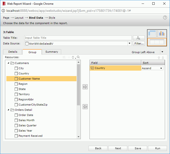
- Click Next to define the table: keep the business view in the Data Source text box unchanged to use the same data source as the crosstab, in the Details tab, add these fields: Customer Name, Product Name, Order Date, and Total, then click the Group tab and add Country as the group by field.
- Click Next to display the Style screen and select JReportDemo as the style.
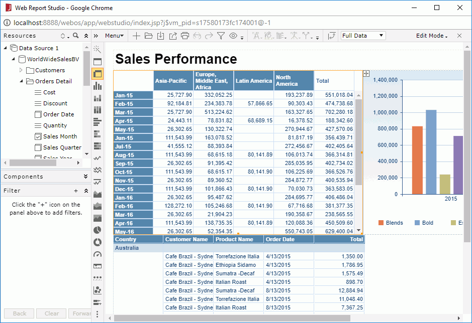
- Click Run. The report is opened in Web Report Studio.
- Click the Save button
 on the toolbar.
- In the Save As dialog, type SalesPerformance.wls in the File Name text field, then click OK to save the web report into the Public Reports > SampleReports folder in the server resource tree.
Task 2: Work with the crosstab
Groups on the crosstab row and column headers can be easily changed using the Switch feature. We will change the row header to analyze data by quarter.
- Right-click the row header and select Switch Row > Sales Quarter from the shortcut menu.
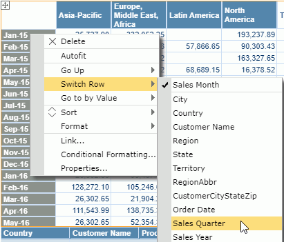
The row header now displays quarters:
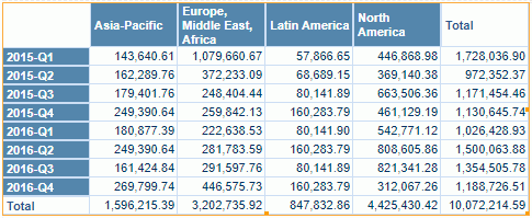
Next we will use the Go feature to analyze data from different views. Firstly let's try Go-to-by-Value, which allows to go to another group based on the current value.
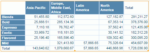
- Right-click 2015-Q1 in the row header, select Go to by Value > Category from the shortcut menu. The crosstab refreshes to show the total sales of each product category in the first quarter of 2015 in different regions.
Next we will use Go-Up and Go-Down to drill data in higher and lower group levels. To use these two functions, you need to make sure the business view used to create the report has predefined hierarchies, so that you are able to go up and down between the group levels in the hierarchies.
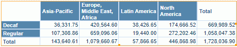
- Right-click on the row header and select Go Up > Product Type from the shortcut menu.
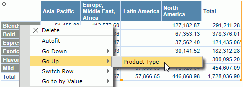
The crosstab changes to:
Now we will go down from Product Type to Category, however it is not simply a reversed process of going up from Category to Product Type. When you go down to a lower group level, JReport will apply the currently selected value as a filter condition to show its data in the lower group level only.
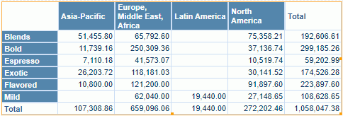
- Right-click Regular and select Go Down > Category from the shortcut menu. The crosstab refreshes to show the total sales of the regular categories in the first quarter of 2015 in different regions.
Crosstab can be converted to chart and vice verse. Next we will use chart to display the data in the current crosstab.
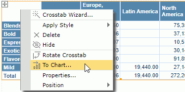
- Right-click the blank cell in the intersection of the crosstab row and column headers, then select To Chart from the shortcut menu.
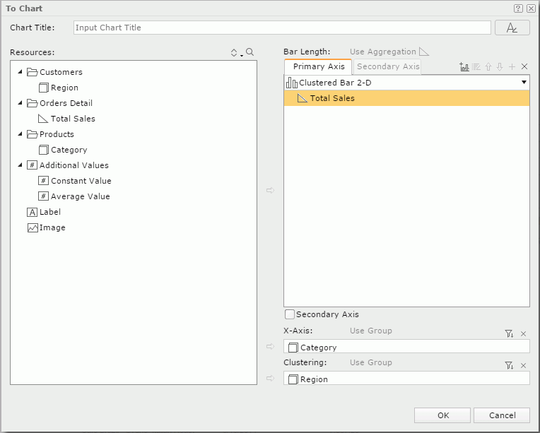
- In the To Chart dialog, the data fields used in the crosstab are listed. We will define the chart based on these fields. Keep the default chart type Clustered Bar 2-D, add Total Sales to the Bar Length box, Category to the X-Axis box and Region to the Clustering box as follows:
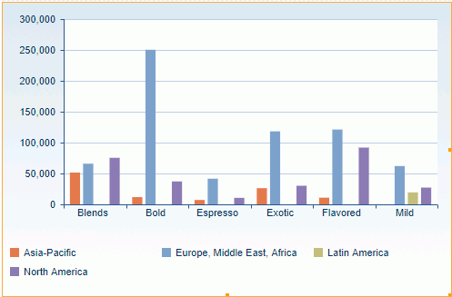
- Click OK to generate the chart.
- Resize the chart. The total sales of the regular categories in the first quarter of 2015 in different regions now displays in chart as follows:
- Click on the toolbar to save the report.
Task 3: Work with the chart
First we want to exchange the fields on the category and series axes.
- Click on the chart to select it, then click the Swap Chart Groups button
 on the toolbar. The chart changes as follows:
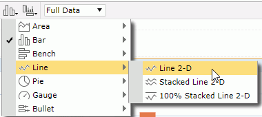
Next we will change the chart type to analyze data in line chart.
- Click the Chart Type button
 on the toolbar, then from the drop-down menu click Line > Line 2-D.
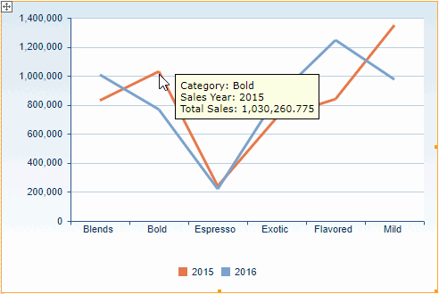
From the line trend we can easily figure out changes of the product total sales in the two sales years. You can put the mouse pointer on any line node to get the detailed data it represents in the chart.
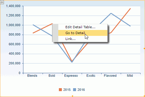
A summary in a report can be linked to a specific detail table. Now we will use this feature to view the detailed information of each chart value.
- Right-click the node that represents the sales of the Bold category in 2015, then select Go to Detail from the shortcut menu.
The detail table of the Bold category's total sales in this years shows as follows:
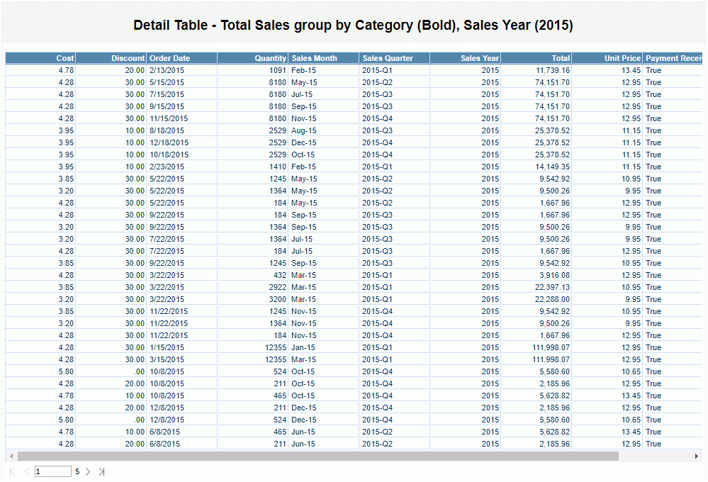
The default detail table contains all the group and detail fields in the same business view category as the aggregate field from which the summary of a report is created. In our case, the default detail table does not satisfy our requirements, so next we will edit the detail table manually.
- Click the Back button
 on the toolbar to return to the main report.
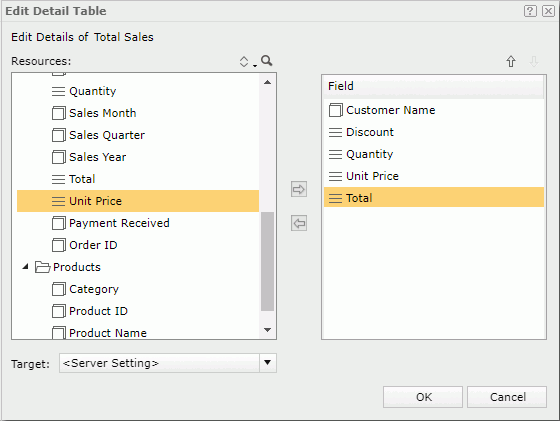
- Right-click any node in the line chart and select Edit Detail Table from the shortcut menu.
- In the Resources box of the Edit Detail Table dialog, all the group and detail fields in the business view used by the chart are listed. Add these fields to the right box to display in the detail table one by one: Customer Name, Discount, Quantity, Unit Price and Total. Click OK to finish editing the detail table.
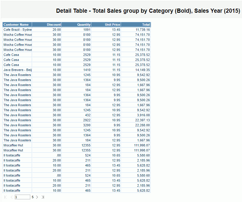
- Right-click the node that represents the sales of the Bold category in 2015 again and select Go to Detail from the shortcut menu. The detail table now shows as follows:
- Click on the toolbar to return to the main report.
- Click on the toolbar to save the report.
Task 4: Work with the table
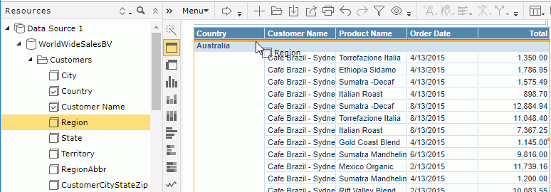
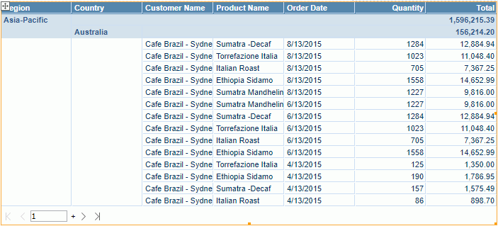
We want to add some fields into the table to get more order information. We will add another group to group the table by region first and then country, then we will and a detail column to show order quantity.
- From the Resources panel on the left, drag Region above the Australia group, release the mouse button when an orange line appears.
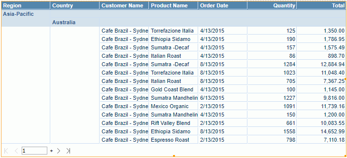
- Drag Quantity to the right border of the Order Date column and release the mouse button when an orange line appears.
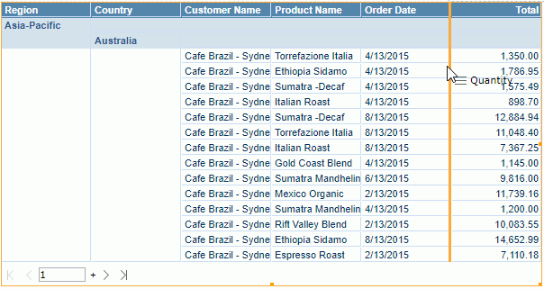
The table now displays as follows:
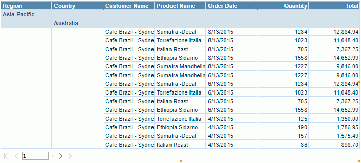
Next we want to sort the table by the order dates in descending order.
- Put the mouse pointer over the Order Date column header, the sort icon appears.
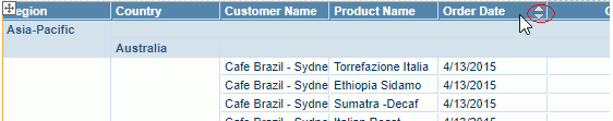
- Click the down arrow to sort the dates in descending order.
Now we will summarize the order total in each group.
- Right-click any value in the Total column, then select Aggregate On from the shortcut menu.
- In the Aggregate On dialog, set the function to Sum and click OK.
We can see the order total for each group is added in the group header.
This operation also creates a dynamic aggregation which is given a default name Sum_Total. You can find it in the Dynamic Resource > Aggregations list in the Resources panel and you can use it again in the report.
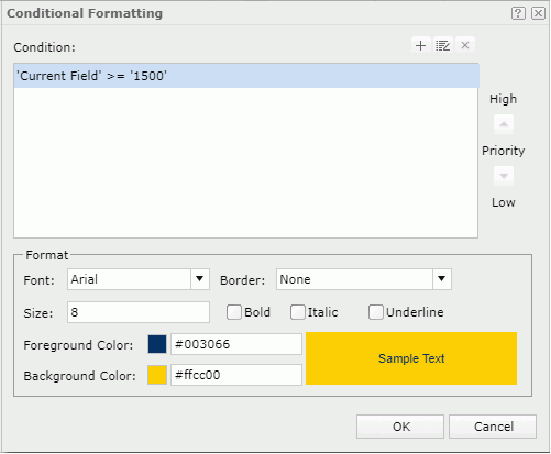
Lastly we will use the Conditional Format feature to highlight the orders the quantity of which are equal to and larger than 1500.
- Right-click any value in the Quantity column and select Conditional Formatting from the shortcut menu.
- In the Conditional Formatting dialog, click
 above the Condition box.
- In the Edit Condition dialog, select Current Field from the field drop-down list, >= from the operator drop-down list, then in the value text box input 1500. Click OK to finish editing the condition and return to the Conditional Formatting dialog.
- Click the color image ahead of the Background Color text box and select the color #FFCC00 from the color palette. Click OK to apply the conditional format setting.
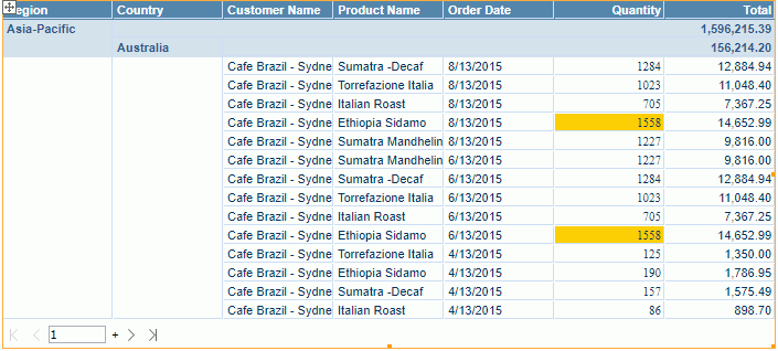
The table refreshes to display as follows:
- Click on the toolbar to save the report.
Task 5: Apply a filter
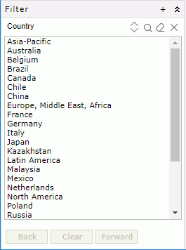
In Web Report Studio, you can apply a filter to each data component in a report individually or use the Filter panel and filter controls to filter multiple data components at a time. For the usage of filter controls, you can learn from Creating Web Reports in the Advanced Part. Here we focus on using the Filter panel to filter report data.
- Click on the title bar of the Filter panel on the left. The Select Field dialog appears.
- Check Country and Region, keep the default Apply To setting, then click OK.
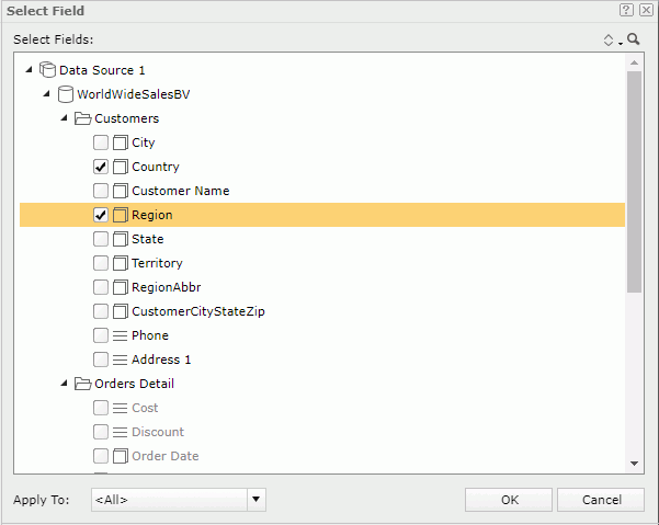
A filter box which contains all values of the selected fields is added in the Filter panel, titled by the name of the first selected field in the Select Fields dialog.
- Click North America in the value list. The report comes out as follows:
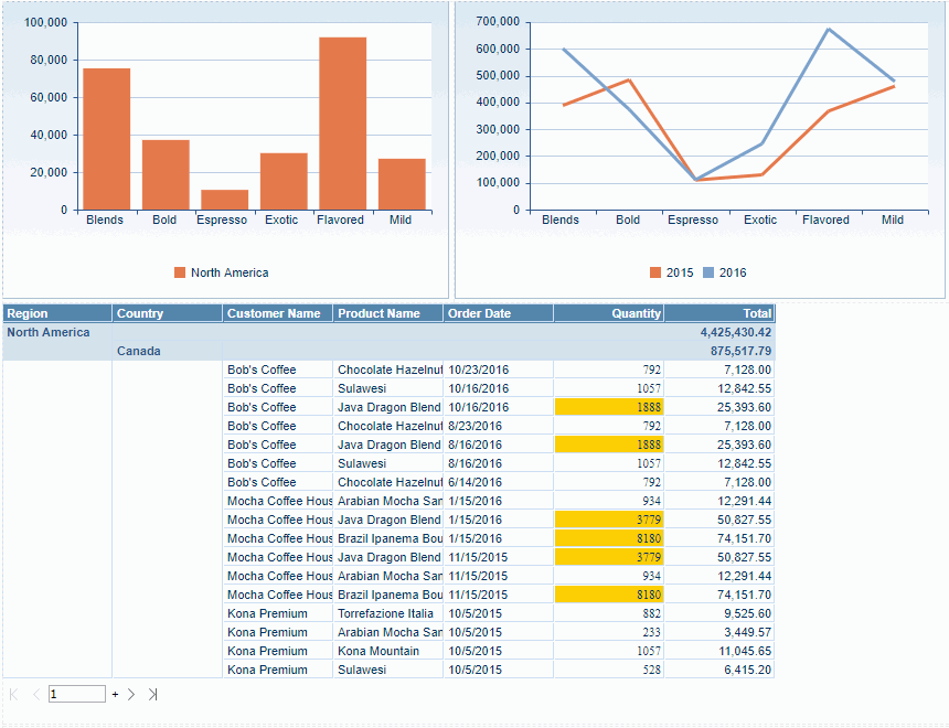
At the meantime, JReport processes values in the filter box to put the countries in the selected region on the top of the value list. You can select a country in the region or another other value to go on filtering the report.
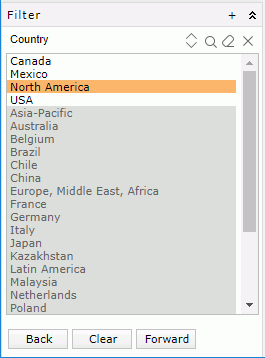
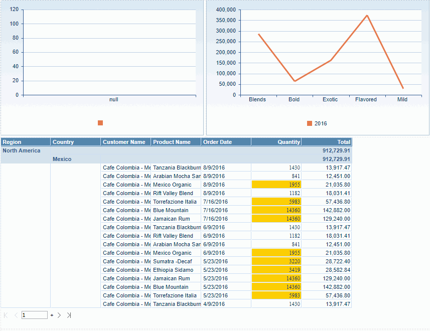
- Click Mexico. The report is filtered to show the following data:
- Click the Clear button in the Filter panel to remove all filters apply to the report via the panel.
- Click on the toolbar to save the report.
Previous Page Next Page