 Previous Page Next Page
There is a component level Export dialog which exports a specific library component, and a dashboard level Export dialog which allows you to export one or more library components in a dashboard into one format at a time.
The component level Export dialog appears after you click  and select Export on the title bar of a library component. It allows you to export individual library component.
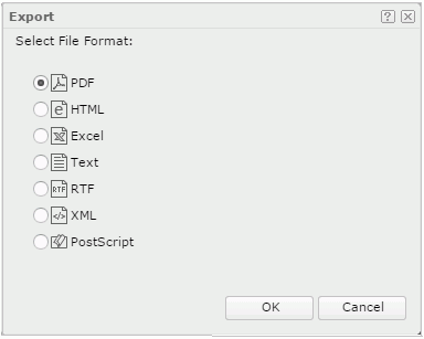
Export File Format
Specifies the format in which to export the library component.
OK
Closes this dialog and starts exporting the specified library components.
Cancel
Cancels the export and closes this dialog.

Displays the help document about this feature.

Ignores the setting and closes this dialog.
The dashboard level Export dialog appears after you click the Export button  on the toolbar, or click the Options button
  on the toolbar and select Export from the option list. It helps you to export one or more library components in a dashboard using the same format.
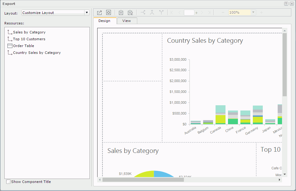
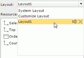
Layout
The system layout allows you to decide the components to export and their exporting order using the Resources box.
Resources
By default all exportable library components are listed and selected. To export some of them, unselect the others.
The order of the listed library components determines the order in which they will be exported. Click the buttons  and
and  to adjust the exporting order if necessary.
Show Component Title
Specifies whether to show the library component titles in the exported result.
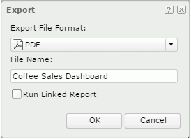
Opens a dialog for doing the last setting and then exporting.
 Page Setup
Opens the Page Setup dialog to specify the page properties of the exported result file.
 Save
Save
Saves changes to an existing layout or opens the Save As dialog for saving a newly created layout. The saved layouts are available in the Layout drop-down list for applying. The layouts that you save will be available to all users using the same dashboard.
 Save As
Opens the Save As dialog for saving a new layout with a name or saving an existing layout with another name.
Options for managing tabular cell
Available to non-system layouts. They are used for customizing the layout in the Design tab.
 Horizontal Split
 Merge
Merge Vertical Split
Options for navigating pages
 First
First Previous
 Turn to Page
 Next
Next Last
LastOptions for zooming in/out the pages
 The usage of the tool:
Design tab
Available to non-system layouts. It is where you customize the component layout. The page size is determined by the page setup properties and the ratio setting. A tabular fulfills the page printable area for holding a library component in each cell. Split or merge the cells and then drag library components from the Resources box into the cells to customize the layout.
When exporting, for tables and crosstabs, only their current view of data as displayed in the dashboard will be exported by default. For example, if a table contains 10 pages of data and you browse to page 3 when you open the Export dialog, then in the exported result, the table will only contain data of page 3. If you want their full data to be exported, you need to use the Filter option on the context menu to switch from Current View to All.
There are these options on the context menu after right-clicking in a tabular cell:
View tab
Available to non-system layouts. It provides a preview of the customized layout. You can click the page navigation and zooming buttons to preview the result.
Displays the help document about this feature.
Ignores the setting and closes this dialog.