 Previous Page Next Page
Link relationship between filter controls
Filter controls are used to filter one or more data components in a dashboard. They can do filtering based on the fields in the business views the data components are created from.
The filters created via filter controls are referred to as on-screen filters.
There are three types of filter controls: text list, single value slider, and range slider.
Text lists allow you to pick one or more random values from a list and are used with categorical or nominal variables. You can choose one or more values from anywhere in the list and there is no mean or median value calculation possible such as States and Countries.
Single value sliders allow you to select one single value from a list and suit for displaying a few values like quarters.
Range sliders allow you to pick multiple sequential values from a list and are used for interval variables such as dates, times, quantity and currency variables where the slider represents the scale from lowest to highest value and the middle represents the median value.
Think about what you need and choose the proper filtering tool.
Both sliders and text lists have the same filtering mechanism.
Filtering based on one field is a common usage. Bind a field to a filter control, and then based on the field to filter the data of the components created from the same business view as the field.
You can also bind multiple fields to a filter control and the values of the fields will be displayed in the filter control. It functions similarly as you put each field in a separate filter control. The difference is that the fields and their values are hosted in one filter control instead of many. If there are same name values, they will be distinctive. The selection of a distinctive value will filter all the data components created using the business views that contain the bound fields to which the value belongs. The usage suits for fields with a few values and you need only one filter control.
Another special usage is to filter components using different business views. Choose a common field all the business views contain and then bind a filter control with the common field in all the business views, that is, select the common field under the nodes of all the business views. The name of the field does not need to be the same, only the values need to be the same.
For example, there are two components containing data from different business views, and you want to filter their data using one filter control. The precondition is that both business views have the field values you want to filter. For example, you would like the two components to show the data of a specific country. In order to do this, insert a filter control into the dashboard, then select both the country fields from the two business views (different business views may use different names for the country field, for example, business view 1 uses "Country", business view 2 uses "P_Country", in this case, you need to select both "Country" and "P_Country"), then from the Apply To drop-down list, select the two components you want to filter, and then click OK. The filter control will be inserted in the dashboard, and you can see it lists country names which come from the two business views. In the filter control select one or more countries, then the two target components will be filtered and only display the data of these selected countries.
When you bind a filter control with multiple different fields, be sure the list of values in each field match so that when you select a value, such as Country, P_Country and S_Country, it will match the appropriate country field in each business view. The logic is the values are OR that is Field1=SelectedValue1 or Field2=SelectedValue1 or Field3=SelectedValue1. Therefore, when Field1, Field2 and Field3 are used in different components you will see the records correctly in each components.
When you bind a filter control with multiple different fields which do not contain the same list of values such as Country, Region and Territory, at runtime after you select values in the filter control, the filter condition will use OR logic to apply the selected values to all the fields of the filter control, for example, Field1=SelectedValue1 or Field2=SelectedValue1 or Field3=SelectedValue1. In this case, when there are three fields but the list of values in each field do not match, the result will have no matching records for two of the components and therefore become blank components. We recommend that you use three different filter controls in cases like this.
After you select values in one or more filter controls in the current dashboard, a filter condition based on the selected values of the specified fields will be applied to the specified data components in the dashboard, each field affecting only the data components based on the same business view as the field.
The filter logic is as follows:
By default, all the filter controls applied to the same data components in a dashboard are interlinked. The link relationship is reflected on the filter values dynamically: selecting a value in one on-screen filter will result in that values which do not belong to the selected value, contain the selected value or relate to the selected value are grayed in all the other linked filter controls for distinguishing. For example, there is a filter control based on the field Country and another on City and they both are applied to the same table. When you select USA in the Country filter control, the values in the City filter control will change as follows if the control has scrollbar: the cities belong to USA are displayed in the upper area of the filter control, and the other cities are put in the lower area and grayed out. If the City filter control has no scrollbar, all the values remain their positions and the values not belonging to USA are grayed out. In both cases all the values are still selectable.
When using a filter control, you can determine whether or not to make the filter control apply the link relationship via the Link to Other Filters option.
Below is an example showing the logic of other linked filters:
When
Filter1 is applied to DC1, DC2, and DC3.
Filter2 is applied to DC1.
Filter3 is applied To DC2.
Filter4 is applied to DC2 and DC3.
The result:
For Filter1, other linked filters are Filter2, Filter3, and Filter4.
For Filter2, other linked filter is Filter1.
For Filter3, other linked filters are Filter1 and Filter4.
For Filter4, other linked filters are Filter1 and Filter3
To insert a text list filter control to the dashboard body:
 on the toolbar to display the Resources panel.
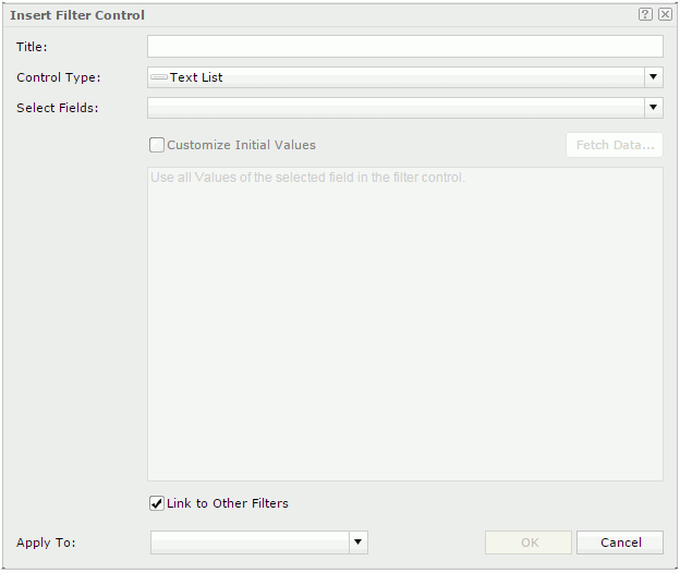
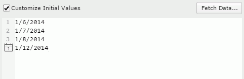
To enter a value, input it in one row, and then press the Enter key to start a new row. General text editing operations including copy, paste, cut, backspace, delete and so on are supported. You need to make sure of the accuracy of the formats and values.
For objects of Date/Time type, you can also specify a value using the  button.
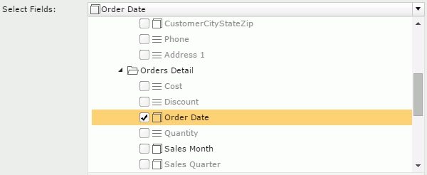
By default, JReport applies the filter to all the data components created using the business views in which the selected objects are obtained. If you uncheck the data components which are based on the same business view as any selected objects, these objects will not be used in the filter and thus their values will not be listed in the filter control.
You can make use of the Ctrl or Shift key to select multiple values. If the values themselves have inter-relationship, after you make the selection, JReport will deal with the rest values to put the related ones on the top and gray the ones that have no relationship with the selected values. The grayed values are still selectable.
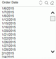
To easily locate the values you want in the filter control, click the Sort  button on the name bar to sort the values in the ascending or descending order. You can also make use of the quick search toolbar to search for the desired values. To display the toolbar, click
  on the name bar. The button
  on the name bar is used to cancel the selection of values in the filter control. For detailed usage about the quick search toolbar, refer to Select Values dialog.
To insert a single value slider to the dashboard body:
on the toolbar to display the Resources panel. 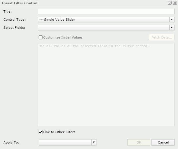
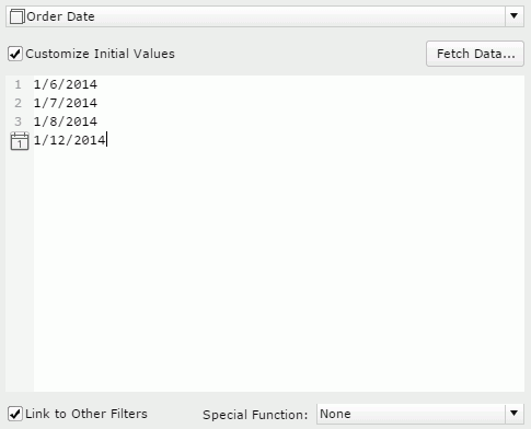
To enter a value, input it in one row, and then press the Enter key to start a new row. General text editing operations including copy, paste, cut, backspace, delete and so on are supported. You need to make sure of the accuracy of the formats and values.
For objects of Date/Time type, you can also specify a value using the button and specify a special function.
By default, JReport applies the filter to all the data components created using the business views in which the selected objects are obtained. If you uncheck the data components which are based on the same business view as any selected objects, these objects will not be used in the filter and thus their values will not be listed in the slider.
To insert a range slider to the dashboard body:
on the toolbar to display the Resources panel. 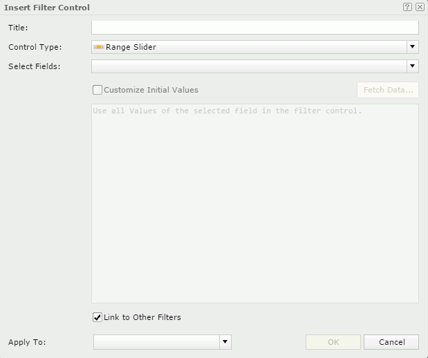
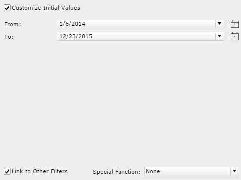
button and specify a special function.
By default, JReport applies the filter to all the data components created using the business views in which the selected objects are obtained. If you uncheck the data components which are based on the same business view as any selected objects, these objects will not be used in the filter and thus their values will not be listed in the slider.
When the Use Default On-screen Filter Values feature is enabled for dashboards, each end user can save the values specified to the filter controls in a dashboard as the default values for the dashboard and for him. Next time when the user runs the dashboard, the saved values will be applied to the filter controls by default. The default values in filter controls work on a user-dashboard basis.
 on the toolbar, go to On-screen Filter Values and then select Save as Default. on the toolbar, go to On-screen Filter Values and then select Clear Default. on the toolbar, go to On-screen Filter Values and then select Restore to Default.
Notes: