 Previous Page Next Page
Format Rectangle (for Library Component)
The dialog appears:
- When there is only one group in the heat map, right-click on the heat map, and then select Format Rectangle from the shortcut menu.
- When there are two or more groups in the heat map, right-click on the heat map, and then select a desired group field from the Format Rectangle submenu.
It helps you to format the rectangles of the specified group, and consists of the following tabs:
OK
Applies the changes and closes the dialog.
Cancel
Does not retain any changes and closes the dialog.
Apply
Applies all changes and leaves the dialog open.
Help
Displays the help document about this feature.
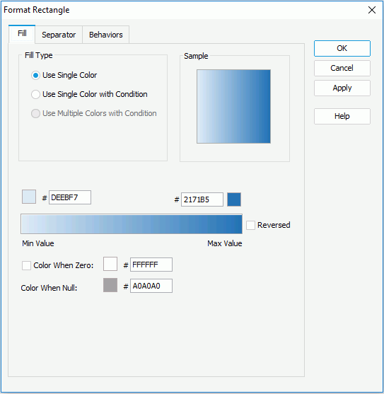
Fill
Specifies the fill properties for rectangles of the heat map.

Use Single Color
It varies with color patterns as follows.
- When the heat map is colored by one of the following cases: no field, 1 to n groups, 1 to n groups and 1 summary
- Color
Specifies the color schema for the rectangles. To edit the color, click the color image and select a color from the color palette or input the hexadecimal value (for example, 0xff0000) of a color directly in the text box.
- Transparency
Specifies the transparency of the color schema.
- Vary Colors by Color List
Specifies whether or not to make colors of the rectangles vary.
- Color List
Specifies the color for each rectangle in the Color List dialog.
- When the heat map is colored by a summary
- Start color
Specifies the start color mapped to the minimum summary value.
- End color
Specifies the end value mapped to the maximum summary value.
- Reversed
Specifies whether to reverse the start color and end color specified on the Chart Platform level.
Once the option is switched between checked and unchecked, the start and end color will be switched and the gradient color bar will be reversed accordingly.
If the option is unchecked, the start/end color on the tab is corresponding to the start/end color on the chart platform. Otherwise, the start/end color on the tab is corresponding to end/start color on the chart platform.
- Color When Zero
Specifies whether to map the zero value to a specific color.
If it is unchecked, the gradient color changes from the start color to the end color directly.
If it is checked, the gradient color changes from the start color to the zero value color, and then from the zero value color to the end color.
- Color When Null
Specifies the color for the null values.
Use Single Color with condition
If checked, each rectangle can have its own single color pattern based on the defined conditions. You can click the Advanced or Normal button to switch between the two editing modes to edit the conditions.
- Normal
- Select Field
Lists all the available fields to which the conditional fill can be applied. Select the field on which you want to define the conditions from the drop-down list.
- Values
Specifies the value of the condition. Available when you select a group-by field or a field whose return value is not a number from the Select Field drop-down list.
- Start Value
Specifies the start value of the condition. Available only when you select a value field or a field that returns a number from the Select Field drop-down list.
- End Value
Specifies the end value of the condition. Available only when you select a value field or a field that returns a number from the Select Field drop-down list.
- Color
Specifies the color that will be applied to the values which meet the condition.
- Transparency
Specifies the transparency for the color of the condition.

Adds a new condition line.
Removes the selected condition line.- Label
If checked, you can modify the condition expression of the selected condition line which will be shown as the legend entry label.
- Value
Specifies to display data in the condition expression as value. Available only when you select a value field or a field that returns a number from the Select Field drop-down list.
- Percent
Specifies to display data in the condition expression in percent. Available only when you select a value field or a field that returns a number from the Select Field drop-down list.
- Advanced
- Condition
Displays the condition you have defined in the Edit Condition dialog.
- Color
Specifies the color that will be applied to the values which meet the condition.
- Transparency
Specifies the transparency for the color of the condition.

Opens the Edit Conditions dialog to create or edit a condition.- Label
If checked, you can modify the condition expression of the selected condition line which will be shown as the legend entry label.
- Value
Specifies to display data in the condition expression as value. Available only when you select a value field or a field that returns a number from the Select Field drop-down list.
- Percent
Specifies to display data in the condition expression in percent. Available only when you select a value field or a field that returns a number from the Select Field drop-down list.
Sample
Displays a preview sample of your settings.
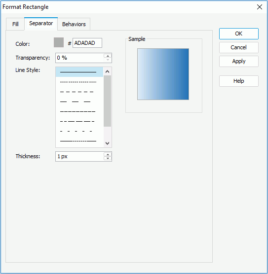
Separator
Specifies the line properties of the separator dividing the rectangles of the heat map.

Color
Specifies the color of the separator.
Transparency
Specifies the transparency of the separator.
Line Style
Specifies the line style of the separator.
Thickness
Specifies the thickness of the separator.
Sample
Shows a rectangle sample according to the settings on the tab.
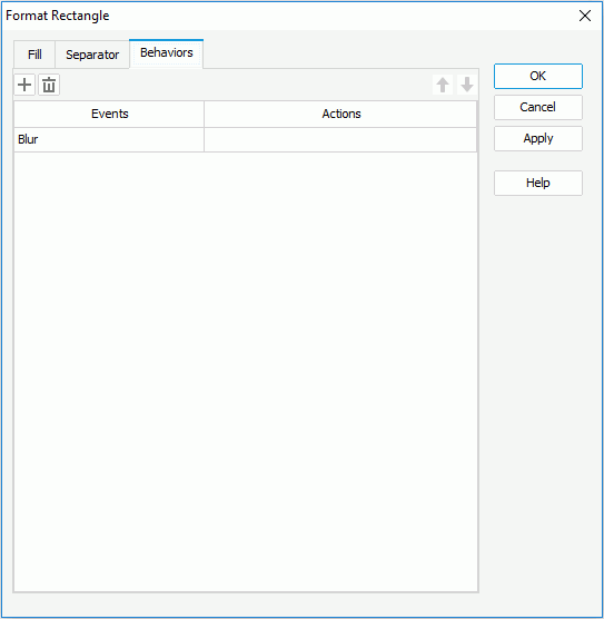
Behaviors
Specifies some web behaviors to the rectangles of the heat map.


Adds a new web behavior line.

Removes the selected web behavior.

Moves the selected web behavior up a step.

Moves the selected web behavior down a step.
Events
Specifies the trigger event by selecting one from the drop-down list.
Actions
Specifies the action you want the event to trigger.
 Previous Page Next Page
 Previous Page Next Page
