 Previous Page Next Page
Creating Dynamic Charts in Excel
You can make data in a chart map to a single cell in Excel, then when you change the data in a cell, the corresponding change will also be displayed in the chart. This kind of chart is called dynamic chart. To create a dynamic chart in Excel, the chart should use the same data as a banded object or table, which is exported to Excel together with the chart. That is to say, each data value in the chart must correspond to the one in the banded object or table. Moreover, the option Report Format should be selected when exporting the report to Excel.
To have the same data with a banded object or table, you must meet the following conditions for the chart before exporting the report to Excel:
- When the chart inherits data from the banded object or table:
- When the chart does not inherit data from the banded object or table:
- The chart should use the same dataset as the banded object or table.
- The chart should have the same group structure as that of the banded object or table.
- The chart should have the same filter/sort condition, Top N condition and special function as that of the banded object or table.
- The chart can only be inserted into the banded header/footer panel or outside of the banded object.
- Different conditions apply to chart based on only detailed records and chart containing summary information:
- For a chart based on only detailed records,
- DBFields on the value axis must be in the detail panel of the banded object or table, and should not be hidden.
- The category value must be in the detail panel of the banded object or table, and should not be hidden.
- If the chart, banded object or table has a Top N condition, then the chart will not be mapped to the banded object or table.
- For a chart containing summary information, the summary on the value axis must be in the banded object or table, and should not be hidden.
The following example shows how to use the Dynamic Chart feature in Excel. Here the chart inherits data from its parent banded object.
- Open the catalog file SampleReports.cat in
<install_root>\Demo\Reports\SampleReports.
- Create a query named Products in Data Source 1 of the catalog, which contains the table Products with all of its columns.
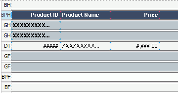
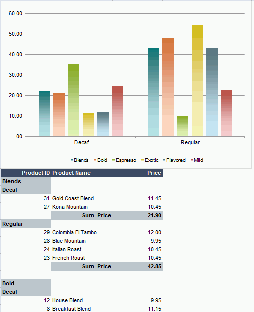
- Create a page report with a banded object in it based on the query Products. The banded report displays the following fields: Product ID, Product Name and Price, is grouped by Category and Product Type Name (Category is the higher level), and takes the Neutral report style. Resize the fields and it displays as follows:
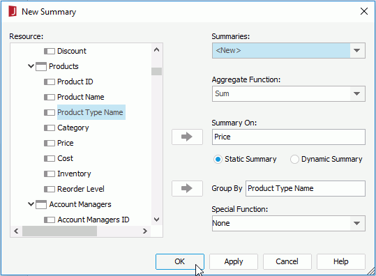
- In the Data panel, click <New Summary...> from the Summaries node and create a summary named Sum_Price which uses the function Sum, sums on Price in the Products table, and applies to the Product Type Name group level.
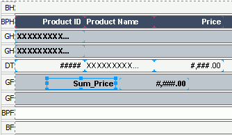
- Drag the summary to the footer panel of the Product Type Name group level in the banded object.
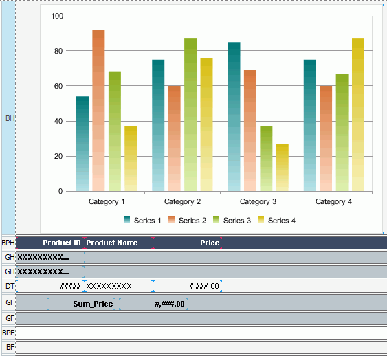
- Click Insert > Chart to insert a Clustered Bar 2-D chart into the banded header panel.
The chart inherits the dataset from the banded object (make sure Current Dataset is checked in the Data screen of the Create Chart wizard), displays Product Type Name on the category axis, Category on the series axis, and Sum_Price on the value axis.
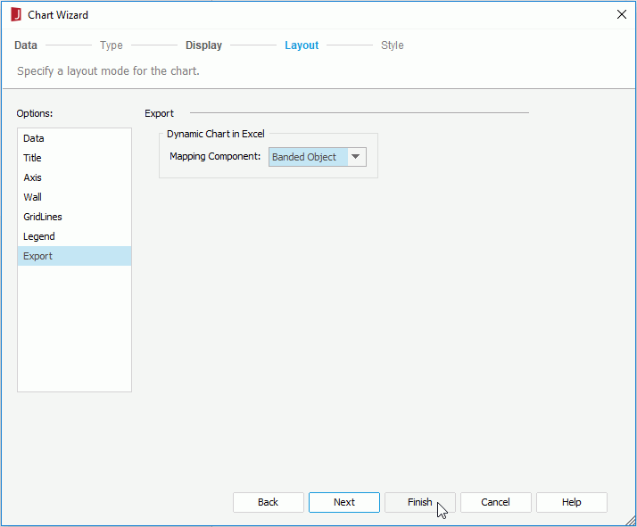
- Right-click the chart and select Chart Wizard from the shortcut menu.
- In the Chart Wizard, switch to the Layout screen, select Export in the Options box and then select BandedObject from the Mapping Component drop-down list, then click Finish.
- Click File > Options. In the Options dialog, check the option Check the availability of dynamic chart for Excel in the General category, then click OK.
This option is provided to check if the chart can be correctly mapped to the banded object when you save the report or export it to Excel.
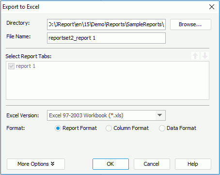
- Click File > Export > Excel to export the report to Excel (make sure Report Format is checked in the Export to Excel dialog).
- Open the exported result file in
<install_root>\Demo\Reports\SampleReports.
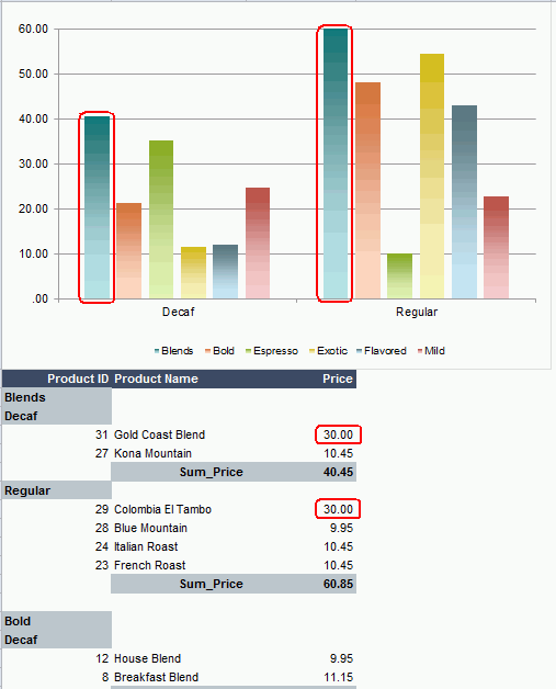
- Change the price of Gold Coast Blend and Colombia El Tambo to 30.00, and you will find that the value of the chart is changed accordingly.
Notes:
- You cannot make charts of bubble, stock and scatter types to be dynamic charts if they have summary value on the value axis.
- Chart and the summary used in the chart cannot be inserted into the repeated panel of the banded object or table.
- For summary chart, only value axis can be mapped to each single cell in Excel. That is to say, when you change the data in Excel, the corresponding value axis will also be changed.
Previous Page Next Page