 Previous Page Next Page
Format Bar Gauge (for Library Component)
This dialog appears when you double-click a bar gauge of a chart in a library component, or right-click it and select Format Bar Gauge from the shortcut menu. It helps you to format bar gauges in a chart, and consists of the following tabs:
OK
Applies the changes and closes the dialog.
Cancel
Does not retain any changes and closes the dialog.
Apply
Applies all changes and leaves the dialog open.
Help
Displays the help document about this feature.
General
Specifies the general format of the bar gauge chart.
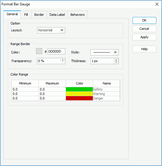
Option
- Layout
Specifies the layout of the bar gauges. It can be vertical or horizontal.
Range Border
Specifies properties of the range borders.
- Color
Specifies the color schema of the range borders. To edit the color, click the color image and select a color from the color palette or input the hexadecimal value (for example, 0xff0000) of a color directly in the text box.
- Style
Specifies the style of the range borders.
- Transparency
Specifies the transparency of the color schema.
- Thickness
Specifies the thickness of the range borders, in pixels.
Color Range
Specifies different colors to fill the bar gauges in different ranges.
- Minimum
Specifies the minimum value of the range.
- Maximum
Specifies the maximum value of the range.
- Color
Specifies the color schema of the range. Click in the color cell to customize the color on the color palette.
- Name
Displays the name of the range.
Fill
Specifies the color, fill effect and transparency for the data marks.
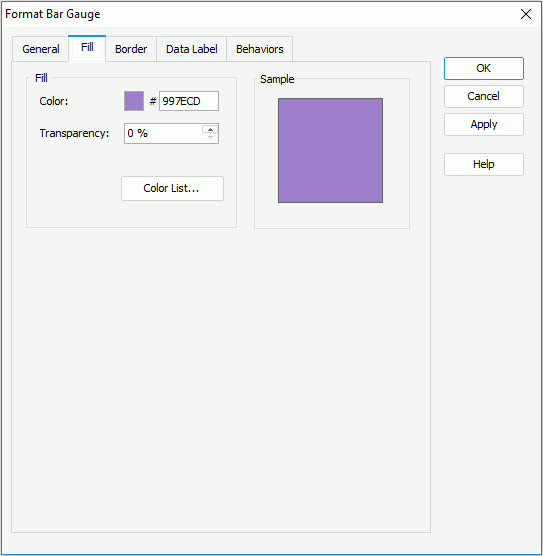
Color
Specifies the color schema for the selected data marks in the same data series.
Transparency
Specifies the transparency of the color schema.
Color List
Opens the Color List dialog to modify color pattern for data marks in the same data series respectively.
Sample
Displays a preview sample of your selection.
Border
Specifies properties for border of the data marks, which take effect only when the Border property on chart paper is set to true in the Report Inspector.
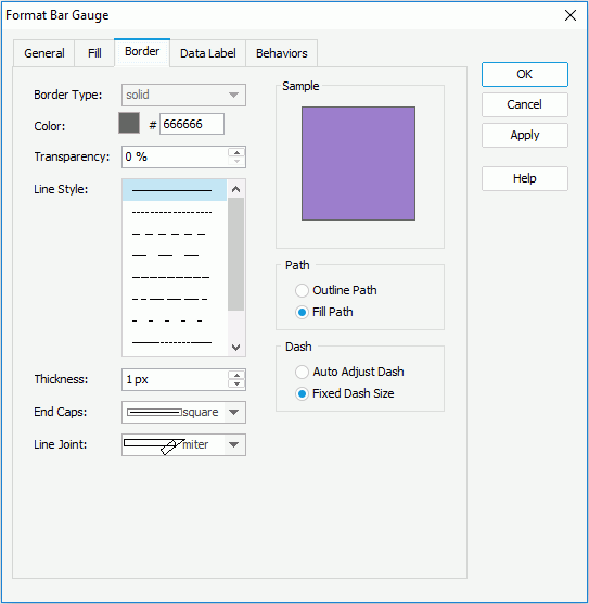
Border Type
Displays the type of the border. The default value is solid, and cannot be changed.
Color
Specifies the color of the border.
Transparency
Specifies the transparency for color of the border.
Line Style
Specifies the line style of the border.
Thickness
Specifies the thickness of the border, in pixels.
End Caps
Specifies the ending style of the border line.
- butt
Ends unclosed sub paths and dash segments with no added decoration.
- round
Ends unclosed sub paths and dash segments with a round decoration that has a radius equal to half of the width of the pen.
- square
Ends unclosed sub paths and dash segments with a square projection that extends beyond the end of the segment to a distance equal to half of the line width.
Line Joint
Specifies the line joint style of the border line.
- miter
Joins path segments by extending their outside edges until they meet.
- round
Joins path segments by rounding off the corner at a radius of half the line width.
- bevel
Joins path segments by connecting the outer corners of their wide outlines with a straight segment.
Sample
Displays a preview sample of your selection.
Path
Specifies the fill pattern of the border line.
- Outline Path
Specifies the fill pattern of the border line to be outline path.
- Fill Path
Specifies the fill pattern of the border line to be whole path.
Dash
Specifies the dash size of border line.
- Auto Adjusted Dash
If selected, the dash size will be adjusted automatically.
- Fixed Dash Size
If selected, the dash size will be fixed size.
Data Label
Specifies properties for data labels displayed on the bar gauges.
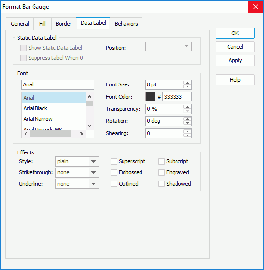
Static Data Label
Specifies properties of the static data labels. Not supported on gauge chart.
Font
Specifies the font format of text in the data labels.
- Font list
Lists all the available font faces that can be selected to apply to the text.
- Font Size
Specifies the font size of the text.
- Font Color
Specifies the font color of the text.
- Transparency
Specifies the transparency of the text.
- Rotation
Specifies the rotation angle of the text around its center, in degrees. The default value is 0.
- Shearing
Specifies the gradient of the text.
Effects
Specifies the special effects of text in the data labels.
- Style
Specifies the font style of the text. It can be one of the following: plain, bold, italic, and bold italic.
- Strikethrough
Specifies the style of the horizontal line with which the text is struck through. It can be one of the following: none, thin line, bold line, and double lines.
- Underline
Specifies the style of the horizontal line under the text. It can be one of the following: none, single, single lower, bold line, bold lower, double lines, bold double, patterned line, and bold patterned.
- Superscript
Raises the text above the baseline and changes the text to a smaller font size, if a smaller size is available.
- Embossed
Makes the text appear to be raised off the page in relief.
- Outlined
Displays the inner and outer borders of each character.
- Subscript
Lowers the text below the baseline and changes the text to a smaller font size, if a smaller size is available.
- Engraved
Makes the text appear to be imprinted or pressed into the page.
- Shadowed
Adds a shadow beneath and to the right of the text.
Behaviors
Specifies some web behaviors to the bar gauge.
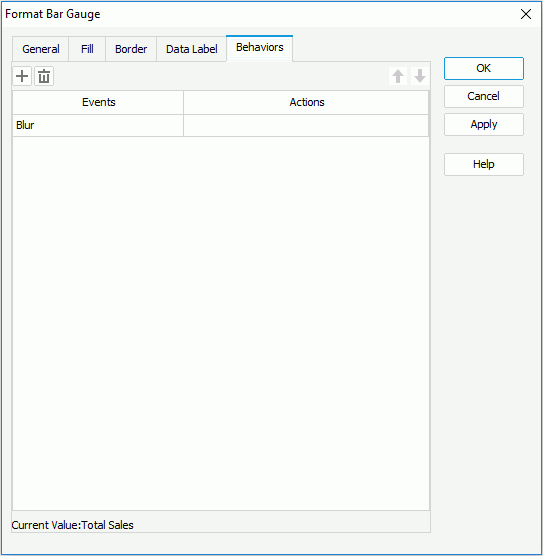

Adds a new web behavior line.

Removes the selected web behavior.

Moves the selected web behavior up a step.

Moves the selected web behavior down a step.
Events
Specifies the trigger event.
Actions
Specifies the action you want the event to trigger.
Previous Page Next Page
